Monday, June 30, 2008

New Home Exteriors (I'll spare you the interiors)

A few weeks ago I showed you some of my favorite houses in my neighborhood along the route I take each morning to Starbucks.  These houses  weren't my only favorites in West University, just the ones I drive by each day.  I could have shown you a lot more homes than I did.   Most, if not all, were new builds - stuccos mainly, French inspired, clean lined with beautiful windows.   The houses were as a whole very attractive, but be clear, not all the homes in my neighborhood are.    Lately, I've noticed a trend in the speculative new house market.  A trend where the builder plays architect and the house's curb appeal suffers immensely from this.

In my small world that I travel each day, I drive through a few different neighborhoods:  mine - West University; River Oaks - the best that Houston has to offer, classic homes, and gorgeous mansions  from the 30s and the 40s; and Bellaire, another small town nearby, encircled , like West U, completely by Houston.   And just like my small town, Bellaire has undergone a resurgence , fueled by young professionals moving in and tearing down the small ranch houses that once populated it.  Bellaire has large lots and more custom houses than West U does, giving it a diverse appearance and less of a Georgian cookie cutter look.   But lately, this diversity has come with a price.

Each year, Bellaire builders compete in a Showcase of Homes where they try to out build each other with more and better amenities, more square footage, more details, more windows - more of everything and anything to win the Best of Show.  The builder is the star here, architects are rarely if ever mentioned.  I don't blame them, I wouldn't want to claim one of these "show" houses myself.  Is it truly harder to design an attractive house?  Is it more difficult to design a home with inviting curb appeal?   I don't think so.  I think it actually must be harder to design one of these detailed overloaded showcase style houses.  Does anyone find these showcase homes attractive?  I know they do sell, but to whom?    Only to people with no design sense at all, or to people who believe that more is better?

Below are a few speculative homes on the market in Bellaire today.  Each is contrasted with a similar home in another neighborhood.   Make no mistake, these houses are creeping with increased frequency into every neighborhood at an alarming rate.   It's just that there seems to be an abundant crop of them in this particular neighborhood.


Spec House #1:   Stucco and stone, I'm not sure exactly what style this is.  Is it Mediterranean or French, contemporary or Tuscan?    Take your pick, there are elements here of each style.  The front loading garage is the focal point.  Can someone please explain the two windows lowered on the stone at the front of the garage?  Are they lowered for children or dogs to peer out of them?    And why are there two faux windows on each side of them?     I count  FIVE  lanterns on the garage alone.  The house itself is barely noticeable, it's so pushed to the back of the garage.  The front door is encased in a square stone facade, again, why?  Two turrets of different heights flank the front door.  The stone work is placed with no regard to design.   The left turret has a stone base, the right turret has a stone facade with bands of colored stucco at its base.  The windows are contemporary, while the house is not.  And why are there three faux windows with a small gable above the right turret on the second floor?   There is nothing, absolutely nothing attractive about this house.  If someone buys it, it will be a miracle.


Contrast Spec House #1 with this home.  Both are large stucco homes with front loading garages. This house is accented with brick instead of stone.  Notice how the garage is placed far back - so far back it is barely noticeable as opposed to House #1 where the garage is the focal point.   The windows above this garage are simple and balance out the arched drive through.  Here, windows flank the chimney in a symmetrically pleasing pattern.  The gable highlights the arched front door and the charming small window next to it.  This home has a cozy, European feel to it.  It's facade is simple without any superfluous detailing.  Which would you prefer?  Where would you be happier, here or House #1?


Spec House #2:  In Bellaire, many of the old houses have significant foundation problems caused by its shifting soil.  To remedy this, care must be taken with how the foundation is built.  Instead of going to the extra expense of adequate foundations, spec builders elevate the houses to avoid the soil problems.  But, since the garage doesn't need to be elevated, the houses become bi level.  Here, you can see the actual house is higher than the garage which causes a strange, uneven appearance to houses constructed this way.   Unfortunately, this way is becoming the norm in the spec housing market here.  This house, again, has a questionable style.  Is it Tuscan?  Again, there is no symmetry.   The two turrets are of different sizes. The plethora of windows are unsettling.  There is no rhythm to their placement.  Does any house need so many differently sized windows?   On the right turret a small window in encased in travertine for some reason.  Above it is a balcony leading to nowhere.  The color of the stucco is unappealing.  There's too much going on with this design, there's no obvious focal point.  It's actually an unpleasant experience for me looking at this home - it's over stimulating.  Is it unpleasant for you too?


By contrast this French styled home has a turret that is barely noticeable.  It serves as an accent rather than the in-your-face turrets of the above Bellaire houses.  The straight facade of this house is pleasing to the eye.  The creamy stucco lends an elegant appearance as opposed to the deep khaki colored stucco house #2.   Here the windows are simple and symmetrical.  There are no windows added that are not needed.  The wood shutters lend just a touch of texture to the smooth stucco.  The single lantern is more effective than a multitude of them.  This architect chose one style and stuck with it, therefore the house appears more honest in its design.  This house is beautiful and it's curb appeal is undeniable.


Spec House #3:   Is this a Beaux Arts styled home?  The house itself looks like an after thought stuck onto the prominent garage.  Rustic wood garage doors belong on another home, not this dressy stuccoed one.  While there is no real turret, the builder could not resist adding the top of a turret here.  It looks the top of a percolator coffeepot stuck on the roof, giving the home a comical appearance.  The windows are a mix of traditional and modern.  The three odd shaped windows to the left of the door are not lined up with each other.  The left one appears to be floating on its own.  The front stairs lead to the grass instead of a walkway.  And, lastly, the iron balconies are typical of showcase homes where the more swirled the wrought iron, the better.  I call this the Coffeepot House.


Similar to House #3, this is a far more beautiful version.   The turret is substantial, yet elegant due to the proper placement of its windows and its proportion to the rest of the house.  The top band of small windows are traditional in keeping with the style of house.  The large window above the garage balances the turret on the left.  The arches of the porte cochere repeat the arch of the front door. Elegant in its white stucco, with black framed windows, this home shows that a front loading garage, designed correctly, can actually be an asset.  I love the stuccoed fence creating a front courtyard.    Very pretty, very simple, less is more - indeed!


Spec House #4:  Stucco home  with, again, a mishmash of windows.  Instead of a tall turret, this builder settled for a short one.  This house could have been saved with a little architectural direction.  If the two balconies were the same instead of dissimilar, if they flanked the front door, instead of were side by side, there would be some symmetry to this house.  Instead, it's a mess.  Is it too much effort to design something with symmetry?  Is it easier to just stick windows wherever the builder wants rather than where they are needed?  Why would there be two balconies side by side that are different?  And please tell me what are those stucco squares on each side of the balcony above the garage?????


This home, similar to House #4, shows again, how pleasing white stucco is over  tan or muddy colored stucco.  Again, the windows are purposeful and simple.  Here the single balcony over the front window balances each other.  The iron railing is simple, not over designed.  The arched door is set inside a stucco arch with a single, effective lantern.  Gray painted wood detailing adds an accent touch keeping the house from being plain.  Again, simple elegance over excess wins every time.


Spec House #5:   This house is a total mess.    Again, I am not sure what style this is supposed to represent.   Any clues?    The white louvered garage door is a nice touch, which is totally wasted on this house.  And its  white color makes no sense - it appears unpainted.  Again, there is no symmetry to the window placement.  Look for instance at the unmatched windows on either side of the front door, second floor.  And why is there a cinderblock looking fence between the door and the garage?  What IS that?    Most confounding of all are the dark stuccoed shapes next to the front door and over the garage.  What are THOSE?  What are they supposed to do?  Add more detail, as if this mess needed more detail?


By contrast, this similar home in white stucco with gray wood trim, again highlights how important color choices are.  Simple elegance, again proving less is more.  Instead of stucco accents like on House #5, this architect placed a pergola atop the garage where vines will one day soften it.  The garage door is wooden and arched and mimics the arch of the front door and the front window.  The simple balcony over the garage is arched, it's iron railings are plain, yet pleasing to the eye.  Compare this balcony to the one above the garage of House #5.  Is there any comparison?  And again, it proves with the deft hand of a competent architect, a front loading garage doesn't have to be an eyesore.  Is it really harder to design something pretty?   I particularly like this home and can envision it filled with Belgian styled furniture painted in tones of grays and whites. 


Spec House #6:  Finally a style I recognize:  Country French.   This home has the potential to be passably attractive, but the details stop it short.  The stucco is a nice color and the stone is an authentic touch, but why would the builder put a section of stone over the right garage in a pie shape?  Mystifying.  Again, the turret is too much.  The windows in the turret are contemporary rather than traditional.  There are too many gables and roof pitches here.    So, while the house has some curb appeal, it's just too too much:  too many windows, too many gables, not enough symmetry, no obvious focal point.


By contrast, this is a country home well designed by an accomplished architect, Houstonian Kurt Aichler.    The windows are symmetrically placed.  The small charming window next to the front door is repeated above it.  The facade has a pleasing movement to it that allows the eye to move from one end to the next.   A brick section is on the left side, followed by a wood plank section, followed by another brick section, and ending with another wood plank section with a screened-in porch above it.  This house exudes country home charm.  Attention was placed to the smallest of detail without any overload.  Notice the charming fence to the left of house with its wooden gate.  Which country house do you prefer, the French styled spec house #6 or this one, designed by a thoughtful architect?


Spec House #7:  Close, but not quite enough to give this house curb appeal.  The builder added a third garage to this house, but no turret!  At least we can thank him for that!   But the garage to the right looks like an after thought, a tower with its own gable that is uneven.   Squeezed in next to the garage tower is a balcony that looks like it was added so that the builder could advertise:  "iron balcony!"  The other garage also has an uneven gable and an odd assortment of windows on the second floor.   The driveway is attractive, but the poorly thought out details overweigh what is good here.


By contrast, note how perfectly placed these gables on this French styled home are.  And also, note the straight roof line behind the right gable. This minor details gives the gables an appearance of depth.   Drawn perfectly by an architect and executed by the builder, the gables are meaningful and architecturally correct, not added just for effect.  Notice too, how perfectly the balcony fits over the front door.  It's delicate iron railing is beautiful.  The shape of the small arched window next to the front door is repeated in the larger front window.  Wood shutters are in light green - a nice touch against the white stucco.  Notice too this thoughtful detail:  the gables are white stucco while the straight facade behind the gables is a darker shade that further highlights the perception of depth in the gables.  A section of white stucco comes up a third of the way on the left side of the house.  This house is beautiful and elegant.  Not a single detail  or accent is wrong.  Notably this house underscores the importance an qualified architect plays in a house's design.  This is a lesson that builders who build just to compete in a Showcase need to learn and learn quickly before they destroy the beauty of our neighborhoods.


Things to ponder:   Do you live in a neighborhood or are you lucky enough to live in a house where architects  rather than builders played a significant role?  Is your house a builder's spec version or an architectural gem?  Is it really harder to design a beautiful house than an ugly one?   Do you agree that simplicity in a home's exterior is preferable to an abundance of details and windows?  Is less really more?

Sunday, June 22, 2008

ASID: An Agency Out of Control

image

Kelly Wearstler can not practice Interior Design in Florida!  If this seems somewhat ridiculous and hard to believe, it is - both.    Apparently Kelly was hired to redo the Tides Hotel on South Beach, but - she is not licensed to practice Interior Design in Florida and a cease and desist order was issued to her.  Don't believe me?  Read her case file below:

 image 

Work by Wearstler - not welcomed in Florida.


  image

Maybe Florida is against faux zebra?


 image

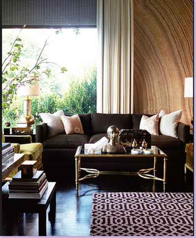
Or could it be they are sick of KWID's famous trellis fabric - shown here in a rug?  Don't miss the wall made out of stone behind the sofa.


Kelly Wearstler:    Case No. 2007-067706

Probable cause was found that Kelly Wearstler, Inc. of Los Angeles, California, is not licensed to practice interior design in Florida and contracted to provide interior design services on The Tides Hotel on South Beach in Miami. Ms. Wearstler specifically offers interior design services in the contract and is offering such services through a business entity without a certificate of authorization. An Administrative Complaint seeking fines will be filed and a Notice and Order to Cease and Desist will be issued.


And don't think poor Kelly is  alone - she's not.   This person, who has been declared by Florida to not be an interior designer, actually DID create this beautiful room below.   Juan Montoya, despite being named to Architectural Digest's Top 100 Designers list,  had Florida say this of him:  "also held himself out as an interior designer..."  Well, duh, he IS an interior designer, rather or not he is licensed in Florida.  What is going on in Florida?


Room designed by supposed interior designer Juan Montoya


Read the case Florida filed against Juan Montoya, THAT CRIMINAL!!!


Juan Montoya Design Group:  Case No. 2004-055870

Probable Cause was found that Juan Montoya of New York, NY is not licensed to practice interior design in the State of Florida and contracted to provide interior design services on a commercial project. Mr. Montoya also held himself out as an interior designer throughout the contract. Further, Mr. Montoya is offering such services through a business entity without a certificate of authorization. A Notice and Order to Cease and Desist was issued and an Administrative Complaint seeking fines was filed.


More beautiful work by Montoya.


Simply put, the ASID is out of control.   For the past thirty years, they have been actively lobbying for state regulation of interior designers  all over the country and it is rumored they have spent over $6,000,000 on their effort.  Their goal is twofold - they seek Title Legislation which bans the right to call or advertise yourself as an Interior Designer without state license AND they seek the more draconian measure of Practice Legislation which criminalizes the practicing of interior design without a state license.  So far, ASID has been successful in establishing Practice Legislation in four states, of which Florida is one.    You can read ASID's side of the argument here: 

http://www.asid.org/legislation  - that is, if you can stomach their arrogance.


So why does ASID want to regulate the Interior Design industry?  They claim it is to protect the public - or as they publicly state:  " Professional interior designers are qualified by education, experience and examination to enhance the function, safety and quality of interior spaces to the benefit of the occupants of such spaces."   But consider this, in the past 100 years only 52 lawsuits have been filed against interior designers - and these were mostly over contracts, never safety.    Because of ASID's forceful lobbying efforts several grass roots organizations have sprung up to challenge their push for state licensing.  These groups claim that the ASID is pushing for licensing out a desire to get rid of competition.  For example:  only 3% of interior designers are members of ASID.   ASID does not speak for the overwhelming majority of interior designers who are, undoubtedly against state licensing.   Despite ASID's extremely low membership,  they have been successful in getting "Title" legislation in many states.  This means simply that someone can not advertise or call themselves an interior designer without meeting the strict terms set up by ASID:  namely, a 2 to 4 year degreed education, followed by 2 years of apprenticeship spent working for a licensed I.D. (of which there are so few - most students would be unable to find work to satisfy this requirement.)   Additionally, you then must pass a 2 day test, which cost upwards of $1,000.  This test does not measure in any way a person's taste level or ability to put pleasing colors together or cohesive furniture schemes, or they ability to get along with clients - all important qualifications of successful interior designers.  Instead, the test focuses on endless rules and regulations for commercial applications such a fire retardant fabrics and codes, contract language, and administration.  Imagine Maria Buatto or Charlotte Moss or Miles Redd or John Salindino or (pick your favorite Interior Designer here)  not being able to  advertise or work as an interior designer because he is not versed in hospital or daycare fabric or wallpaper or proper placement of accessibility bars?   It is important to note that the qualifications for admittance into ASID are exactly the same as is required of state licensing as devised by the ASID.   There are grandfathering clauses for the lucky few  - and many foes suggest that most of those in the higher ASID ranks do not even qualify under their own rules and regulations but were actually grandfathered into ASID. 

Most shocking is this:  four states have enacted "practice" licensing - meaning not only can you not advertise or call yourself an interior designer, you can not practice as an interior designer without this license.  Florida is one of these states.    The sheer arrogance of Florida to declare that  Kelly Wearstler or Philip Sides or Juan Montoya are not interior designers is stupefying.  

What is being done:  after ASID's massive 30 year push for regulation, grass roots efforts are finally having a positive effect.  In 2007, ASID lobbied for 24 new bills, none of which were enacted.  Even more positive, the Alabama Supreme  Court ruled that Alabama's Practice laws (similar to Florida's) were illegal and were to be removed from the books.  Notice of this ruling is surprisingly absent from the ASID web site.   Interior designers in Alabama are now free to practice their trade without ASID involvement and regulation.  Hopefully, the three remaining states with Practice licensing will meet the same fate.   Additionally, several governors vetoed title and practice legislation put before them.  In Texas - which has a strong title law - a lawsuit has been brought before the state by 4 interior designers who have the backing of  The Institute for Justice.  The Wall Street Journal published an excellent letter from one of their attorneys, read it here to fully understand the absurdity of the licensing laws.   The Interior Designers Protection Council  has an great web site where you can further read about efforts to derail ASID's legislation push. 

If you are an interior designer or an interior design lover please take a few moments to read what is happening in your state legislature.  Protect Phillip Sides' right to practice doing what he does best, despite Florida's attempts to stop the prolific interior designer.


A Philip Sides' dining room.

Red toile bedroom with red-checked upholstery and linens.

Toile and checks - my favorite combination by Phillip Sides.

Room covered in green toile.

The beautiful Scalamandre Oriental toile as done by Philip Sides. This is one of my favorite toiles - I love the movement of its flower stems.  Also - notice the beautiful sconces and matching painted consoles.  Beautifully done room for such an amateur without qualifications or licensing.  I mean - how could he do this good of work and not have passed a test on contracts?


Read what horrors Sides is accused of by Florida's lawmakers:

Phillip Sides
Phillip & Co.
Case No. 2004-043524

Probable Cause was found that Phillip Sides of Santa Rosa, Florida is not licensed and is offering interior design services in an advertisement in the Southern Accents Magazine. A Notice and Order to Cease and Desist was issued, along with the request that Mr. Sides sign an affidavit stating he will refrain from offering interior design services and will change the advertisement deleting any references to interior design or words to that effect. If Mr. Sides fails to return the affidavit, an Administrative Complaint seeking fines will be filed.

Philip!  You should be ashamed!  Imagine calling yourself an interior designer.  Now, stop that - you are an interior decorator!!!  Got that??    You do not design, you can NOT design - you don't know how - you aren't licensed!!!  Shame!!!!


Clive Christian, the famous cabinet maker also ran into trouble with Florida. 


Christian, the cabinet maker genius - his cream painted kitchen.


800

Clive Christian Gulf Coast LLC
Simon T. Ellis
Case Nos. 2006-060591 & 2006-060581

Probable cause was found that Clive Christian Gulf Coast LLC of Estero, Florida is not licensed to practice interior design or architecture in Florida and is offering interior design services in an advertisement in the August 2006 edition of the Florida Magazine.  Further, the firm’s web site is offering architectural services.  A Notice and Order to Cease and Desist was issued along with the requirement that Mr. Ellis sign an affidavit stating he will refrain from offering interior design or architectural services and will change his advertisement and web sites to delete any references to such services.  If Mr. Ellis fails to return the affidavit, an Administrative Complaint seeking fines will be filed.


And even Venus Williams the tennis player got in trouble with Florida.  Venus?  An interior designer? 

V Starr Interiors
Case No. 2003-001143

The Florida Board of Architecture and Interior Design announces that on March 20, 2003, probable cause was found to issue a Notice and Order to Cease and Desist against the unlicensed design firm of V Starr Interiors, which is owned by tennis star Venus Williams. V Starr Interiors is located in Palm Beach, Gardens, Florida.

Ms. Williams has a licensed interior designer on staff; however, V Starr Interiors has been operating and offering interior design services since April 2002 without a license for the firm, which is required under Florida law. After being notified of the investigation, the firm has begun the process of obtaining a license.

After reviewing the evidence, the Board found probable cause to issue a Notice and Order to Cease and Desist and will require Ms. Williams to execute an affidavit that she will not offer interior design services through her firm until properly licensed. If Ms. Williams fails to return the affidavit, an administrative complaint seeking fines will be filed.


Interiors by Venus Williams - hmmm - maybe Florida IS right about this one!


It's a good thing I don't live in Florida.  I would not be a licensed interior designer, and would be unable to advertise or call myself an interior designer while doing work for clients like this:


 Caplan house 004

Living room in a client's house.

or this:

 Caplan house 058

Bedroom in a client's house.  Farrow and Ball Wallpaper, Chelsea Editions fabrics, Antique chairs from Tara Shaw, Antique mirror from Area, Curtains by Custom Creations by Monica.


Below are more interesting cases brought against Florida interior designers.  Not all are famous - but all are talented, hard working people whom ASID wants out of business.  Beware!!!


Norwalk – The Furniture Idea
Parker C. Kuldau II
Case No. 2007-037517

Probable cause was found that Norwalk – The Furniture Idea of Jacksonville, Florida, is not licensed to practice interior design in Florida and is offering interior design services in magazine advertisements.  A Notice and Order to Cease and Desist from offering interior design services was issued along with the requirement that Mr. Kuldau sign an affidavit stating the advertisement has been changed to delete all references to interior design.  If Mr. Kuldau fails to return the affidavit, an Administrative Complaint seeking fines will be filed.


Kreiss Collection
Case No. 2004-002015

Probable cause was found that Kreiss Collection of West Palm Beach, Florida is not licensed and is offering  interior design services in an advertisement and on its webpage. A Notice and Order to Cease and Desist was issued along with a request that Loren Kreiss sign an affidavit stating she will refrain from offering interior design services through Kreiss Collection unless it becomes properly licensed. If Ms. Kreiss fails to return the affidavit, an Administrative Complaint seeking fines will be filed.

Interiors by Decorating Den
Melissa and Eric Johnson
Case No. 2006-051229

Probable Cause was found that Interiors by Decorating Den of Dunnellon, Florida is not licensed to practice interior design and is listed under the interior design section in the Ocala yellow pages. A Notice and Order to Cease and Desist was issued along with the requirement that Ms. Johnson sign an affidavit stating the firm will refrain from offering interior design services and the advertisement will be changed to delete any references to such services.  If Ms. Johnson fails to return the affidavit, an Administrative Complaint seeking fines will be filed.


Patty Castillo
Case No. 2005-047653

The Florida Board of Architecture and Interior Design agreed to enter a final order imposing a fine of $10,000.00 plus costs against Patty Castillo of Pembroke Pines , Florida . Ms. Castillo was offering “Professional Interior Design Services” in an advertising flyer.

Millie Becker
Case No. 2004-038448

Probable Cause was found that Millie Becker of Boca Raton, Florida is not licensed in the State of Florida but holds herself out as an interior designer on her business card. A Notice and Order to Cease and Desist was issued, along with the request that Ms. Becker sign an affidavit stating she will refrain from offering interior design services and will change her business card deleting any references to interior design or words to that effect. If Ms. Becker fails to return the affidavit, an Administrative Complaint seeking fines will be filed.


Jenny Cocanougher
Case No. 2003-050487

The Florida Board of Architecture and Interior Design ruled to enter a final order imposing a $10,000.00 fine and costs of $318.00 against Jenny Cocanougher. The complaint alleged that Respondent was previously a licensed interior designer but her license was placed in a null and void status for failing to renew. Ms. Cocanougher's business card and resume held her out as an interior designer and she contracted to provide interior design services.

 
Rick Argov and Interior Design Center
Case Numbers 2003-002640 and 2003-001382
Rami Argov and Interior Design Center
Case Numbers 2003-002389 and 2003-050456
Uri Gavish and Interior Design Center
Case No. 2003-002387

The Florida Board of Architecture and Interior Design announces that on October 30, 2003, a final order was entered imposing a fine of $15,000.00 against the Deerfield Beach design firm Interior Design Center and its principals, Rick Argov, Rami Argov, and Uri Gavish.

The firm and its principals were holding themselves out as interior designers and offering interior design services without a license. The firm also contracted to perform interior designs services.

After reviewing the evidence that showed the firm brochure and individual business cards offered interior design services, along with the numerous contracts for interior design services, the Board entered a final order imposing a fine of $15,000.00.

The Board is charged with enforcing the laws and rules regarding the practice of architecture and interior design, and to protect the health, safety and welfare of Florida's citizens.

Friday, June 20, 2008

Photoshoot #2

my house 057 

I had a little excitement at my house a few weeks ago:   a photography crew came and took pictures to put in a national magazine next October.   The editor picked two rooms for their publication:  my family room and  the guest room.  Actually, the choice of rooms was strange to me.  While I do love my family room, it's not really "decorated."  I think my living and dining room would have been better picks.   And my guest room?????   That choice is really beyond me - I like my master bedroom much better!! 

The history of our guest room is a long one, starting when it was used as my daughter's nursery.  At that time, it was wallpapered in an English paper of pink and white dots and it was decorated with a Waverly (remember Waverly?) pink and green chintz and a cotton pink and white ticking.   There was an iron daybed and a dhurrie rug that I liked to pretend was really a high end needlepoint.


lissroom 001

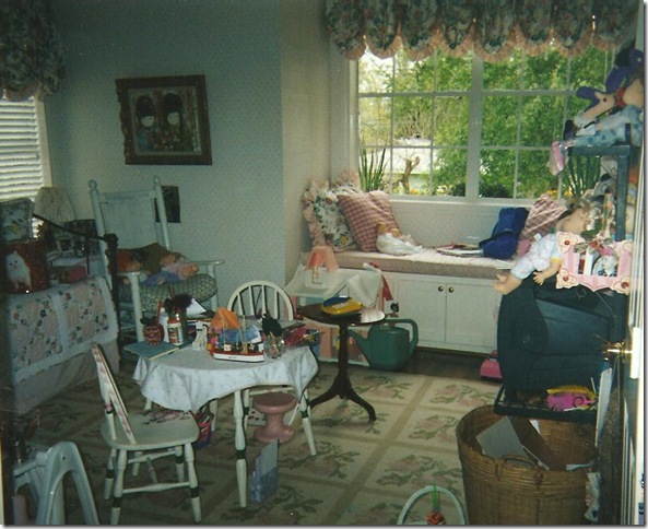
The guest room as it once was, a nursery.


What a dump!    Well, if I could go back 14 years, I would certainly style this mess!!!!  This is definitely the room of a very active  little girl who liked to play with dolls and toys, instead of with boys like today.  Oy!  I even spy a play telephone sitting ready on the side table - a hint of things to come!!   The iron daybed is on the left with its pink and white ticking bedspread.  Covering it was a quilt my mother in law made for my baby.  The window seat's cushion was also in the pink and white ticking and all the pillows and curtains were in the Waverly chintz.  The dhurri, or, faux needlepoint rug, is shown.  Trust me, this room used to be really cute before "the Princess" starting growing up and making a mess of everything.  As it turned out, my daughter grew bored with this room (more hints of things to come) and moved into another bedroom, leaving this room to slowly languish, unused.   In order to get the redecoration of the nursery rolling,   I knew that first, the wallpaper had to go.   So one day, I had my painter remove it and paint the walls a color very similar to Restoration Hardware's Silver Sage.  The iron day bed was given away, as were all the pillows, the ticking, the chintz and the faux needlepoint rug.  My daughter moved on too - to Ikea and West Elm.  A few years ago she redecorated her new room, by herself and with very little help from Mom.  Yes, it was hard for me to relinquish that control, but Elisabeth is willful and very independent.  Here's what her room looks like today:


Snap14

The Princess' room today.

The bed, bookcase, and tables are from West Elm.  The mirror and desk are from Ikea.  I had the softgoods made for her from what she picked out:  silk purple for the windows and a crushed silk velvet for the duvet.  The walls are a silvery lilac and the ceiling is a deeper purple - both from Pratt and Lambert's faux paint line.  The light fixture is made from trendy capiz shells.   She's been hinting lately that she wants to move back into her old room, which is now the redone guest room.  I am hinting back too, "I don't think so."


Snap15

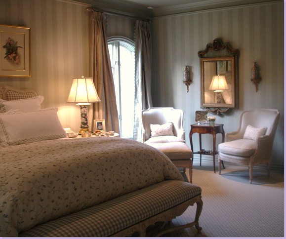
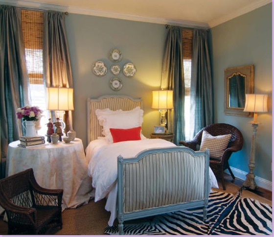
The guest room as it was photographed last year for Houston House and Home magazine (read the article here.)


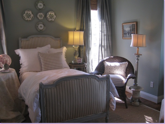
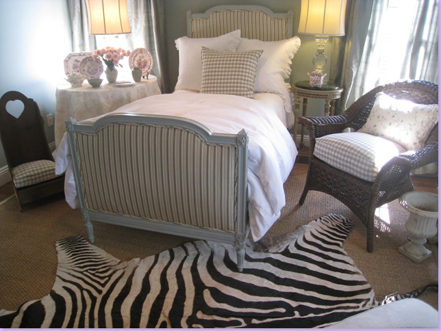
Last year, you may remember, my home was photographed for a Houston magazine:  Houston House and Home. Above is how the guest room looked then.  I was given a very short time to get the empty and mostly junked out room into shape last year.  The bed, an antique french day bed I bought on sale from Maison Maison, was luckily already upholstered in a green silk stripe.  I bought some white linens, curtains and lamps from Restoration Hardware.  The skirted table is Bennison - a nice left over from a client who rejected it.  The zebra was new, bought at Round Top and layered over seagrass.   The day before that shoot last year, I ran out and bought two orange pillows for a color pop from Area.   I thought it looked ok.   Apparently, the national magazine thought so too - they wanted to put it in their own magazine.  After last year's physically tiring and mentally exhausting photo shoot, I swore I would never do it again.  But, somehow, here I was, less than a year later, again welcoming strange photographers into my house.   Of course, nothing is ever easy.   

Exactly one week before the big photoshoot, I received news from the local scout.  She had a list of things the editor wanted changed for the shoot.  Oh?  Really?  The editor and art director  wanted a new window seat cushion (made out of the Bennison fabric, no less!) The zebra rug HAD to go - apparently their readers object to zebra rugs, the suzani on the chair also had to go (suzanis are too bright) and the neon orange pillows must also go to be replaced by other pillows (like what other pillows, I wondered?)  Now understand, I had known this shoot was going to happen for about three months - three months that I could have gotten all these changes done with no problem.  Instead, the editor gave me one week to get the new cushions and pillows made.  Luckily I had  a little fabric in the garage left over from a few jobs, so I didn't have to order the Bennison fabric which never would have arrived in time, never mind how expensive it is.  I called my trusty assistant Monica, from Custom Creations by Monica, and she ran over that night to measure.  In the end, she got the workroom to rush the new window seat cushion, 7 new pillows, a new seat cushion for the wicker chair, and two new cushions for the two child's chairs.   I ran out and bought a new Blanc d'ivoire desk and lamps to take the place of the hideous TV stand in the room.  Monica showed up exactly 6 days later with her bounty, thank God.

When they all arrived. the scout and the photography crew seemed happy with the new changes.  It was a much different shoot than the one done last year.  This time, each photograph took over an hour to complete - the attention to detail was that time consuming.  The crew was uber professional and fun at the same time.  They overtook my small house like an army at headquarters.   It was an interesting learning experience and I am anxious to see the finished product.  I've been told that my family room will be shown in October and the guest room will be in another month's issue.  I'll be sure to share the details as soon as I know them.  As for the changes the editor asked for - I'm happy with most of them and plan to keep them.  In the end, the editor and art director, the scout and the photographer all knew better that me, I guess.

And one last note:   apparently the magazine scouts are always on the look out for homes to nominate for publication.  If you think your house is "photo ready" or could be with a little help, please email me.  I'd love to pass on prospective homes to them!  Don't be shy!


my house 086

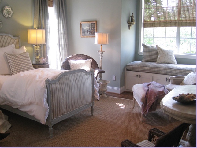
Here's how the guest room looked for the new photoshoot.     Chelsea Editions check and vine pillows replaced Area's orange ones.  I added the cushion and pillow in the wicker chair.  Zebra rug was pulled out.  Everything is softer, the colors muted - no bright colors or contrasts.


my house 056

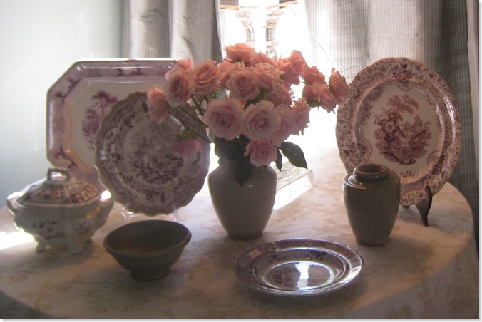
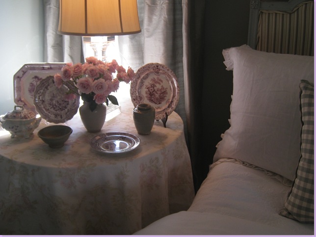
The mulberry transferware used to be on my entry hall table but now is permanently in the guest room where it looks much better on the Bennison skirted table.


  my house 065

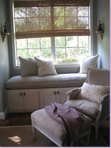
The new check window seat cushion with new pillows.  The chair and ottoman are from Blanc d' ivoire.  A softer lilac pashmina replaces the bold suzani that the editor asked me to remove.  I like this much better and plan to keep this change.


my house 067

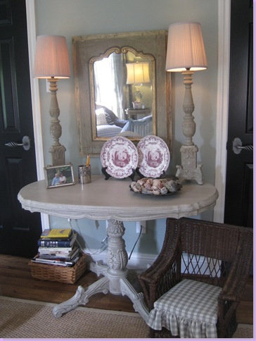
I took out the hideous tv stand and added this table from Blanc d' ivoire along with their lamps.   The mirror is from Joyce Horn.  Cushion was made for child sized chair.  


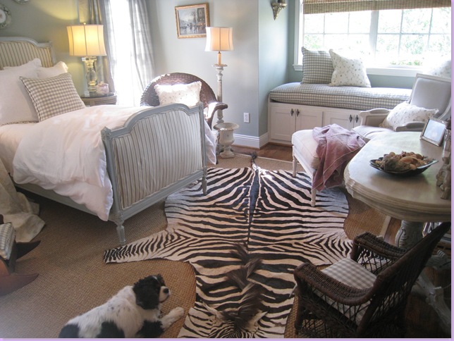
Now, the big question is - should the zebra rug go back in?  I can't decide - so please leave me a comment with your opinion - yes or no!  I'm just not sure I like it in there anymore.  What do you think?  Here are some pictures to help you decide:


my house 095

The zebra rug back in the room - yes or no?


my house 083

With or Without?


my house 090

Sammie Jo loves it, but I'm not so sure - what do you think?  Too much?


There were lots of changes in the family room too - I'll show you those in a few days.  Remember - email me if you think you have a house worthy of a magazine shoot.  Seriously!

Tuesday, June 17, 2008

Vieux Interiors

image009


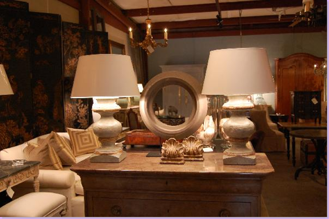
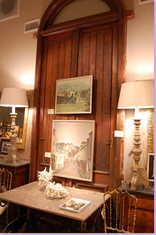
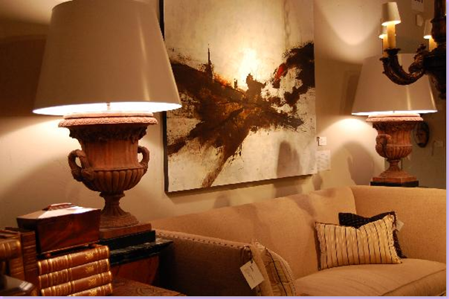
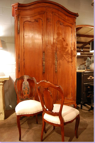
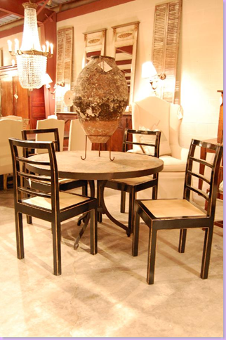
Hidden away near the Heights in Houston is one of the more delightful and beautiful antique stores around:  Vieux Interiors.   Open for just a few years, Vieux is the brainchild of Benton Lackey and Marty Bratton.  Lackey has long been a fixture on the Houston antiques scene, though he usually prefers to be behind the scenes.  Called by some "a creative genius," Lackey has an uncanny sense of color and texture, which he combines with his love for antiques and design.  After a long stint on his own and more recently at AREA, Lackey teamed up with Bratton to open Vieux Interiors.  Bratton brings along his keen business mind to their endeavor.  Their secret weapon, besides the inventory, is DeWayne Formby.  DeWayne, of course, is the former salesman extraordinaire from Carl Moore Antiques.  Carl and Bert Melnick hired DeWayne, freshly armed with a degree in Interior Design, straight out of college.  Ever loyal, DeWayne stayed with Moore and Melnick for 17 years until they sold their shop.  After spending time as an independent designer, DeWayne was lured back into sales by Lackey who hired him to run his new venture - and who can blame him?  If there is a more personable, friendly, and sweet, yes - sweet! antiques man in the business, I haven't met him.   DeWayne always has a kind word to say,  a friendly laugh, or  a poignant story to share.   With DeWayne at the front door, Vieux Interiors, is assured to remain accessible, a place to go to learn something new about antiques, or just to gaze at the eye candy - without being hassled or pushed.  The consummate gentleman, DeWayne is thrilled to be back in the antiques business, ready to help all his clients, old and new alike.  

Vieux Interiors is a little hard to find, so get instructions before you head out.   Close to the Heights and the Memorial Park area -  stop in and be sure to tell DeWayne HI for me, if you go!!!

image

The delightful and ever helpful, DeWayne Formby. 


image

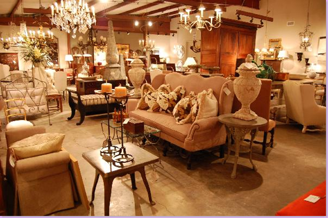
Ah yes, what a Vieux!  Let's see, I'll take that French sofa with the serpentine back, the urn right next to it, the French wing chair behind it.........and on and on!!!  Now, this is what an antique store should look like!


image

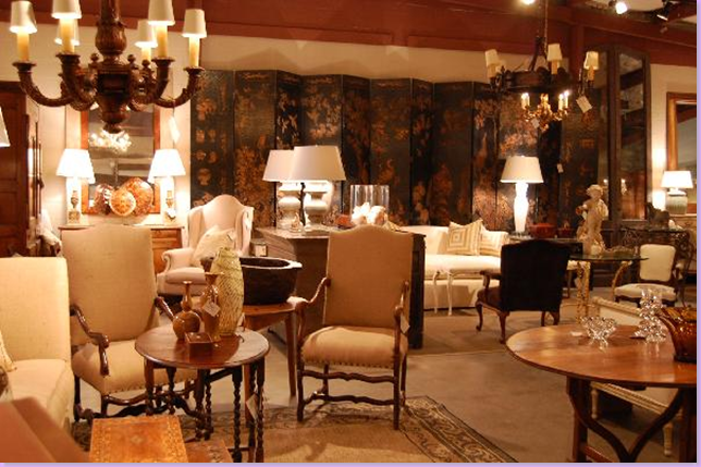
Nice pair of French arm chairs.   I spy a great wine tasting table on the far right.   And the oriental folding screen in the back looks pretty amazing.


image

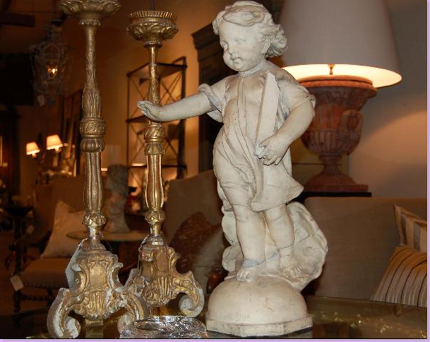
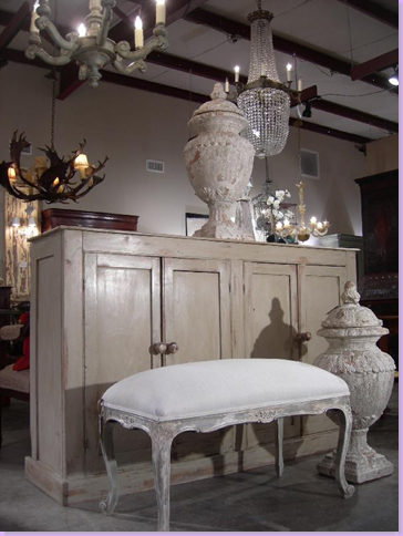
Two major trend alerts:  Concrete garden statuary for inside the home and water gilded candlesticks from an ancient Catholic church somewhere in France, I'm sure.


image

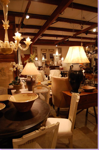
French cane side chairs and a Murano glass chandelier.


image

Great urn lamps with paper shades.   I wish you could see the entire painted chest they sit on, it looks really interesting, doesn't it?


image

I adore these chairs!  And the shutters hanging on the wall, and the crystal chandelier, and the tall wing back chair.  And.....


image

Antique doors, gold ballroom chairs, and a great pair of candelabra lamps.


image

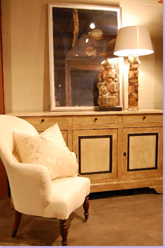
Mixed in with all the antiques is a great selection of modern art, as seen here.


image

But I prefer the antiques, like this massive French armoire, don't you?


image 

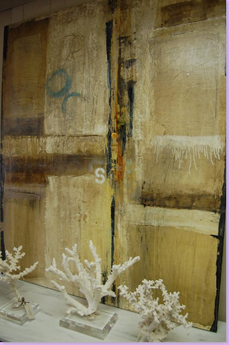
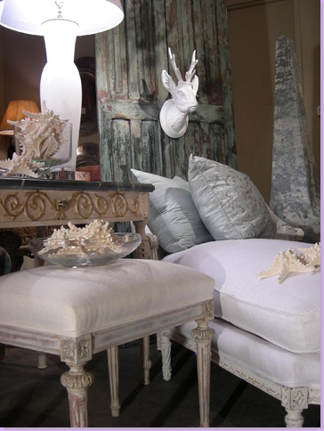
Major trend alert II:  Coral!  More modern art -  I really like this piece of art, it's colors are subtle and would look  good in a Belgian interior.


image008

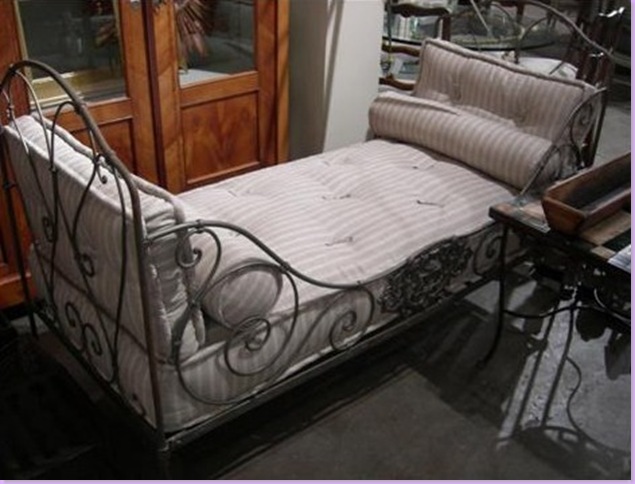
My favorite!  An antique iron French daybed.  I love this!!!  Dewayne, what's my price on this?


image

The inventory never ends.  Every picture is just amazing, isn't it?  Here, an antique armchair awaits upholstery or, in my case, a great slipcover!  


image

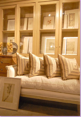
Another French daybed with silk pillows.  The cabinet looks interesting - I love how it's filled with prints instead of knick-knacks.


image

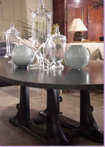
New accessories:  glass canisters and blue opaline bowls atop an industrial type table.


image 

OK, I'm in love!!!!   With everything in this picture!


image

Wait, more?  Beautiful painted French chaise and stool.
 

image

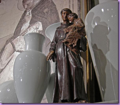
And finally, more from their new collection of blue opaline glass, along with a religious statue. 


If you go, Vieux Interiors is open Monday through Saturday - though closing time on Saturday is at 3:00 pm.   Call DeWayne at 713-868-5844.  Map to Vieux Interiors is below:


image