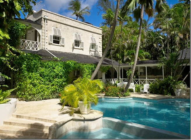
Continuing on our Caribbean theme, another important estate on the island of Barbados is known as The Great House. Built on 1 1/2 acres at Turtle Beach on the west side of the island, the house is famous for its former owners - Sir Evelyn de Rothschild and his then wife, Victoria. Though the main house is built of coral stone and resembles a centuries old plantation, it was built in 1988 by Ian Morrison, one of Barbados’ busiest architects. The main house has an airy, open feel with a master suite on the first floor and three bedrooms on the second floor, each with its own bathroom and verandah. Four chattel houses were added to property to further the appearance of age: chattel houses were typically found on the sugar plantations in the Caribbean and they housed the workers, or slaves. At The Great House, each Chattel House has one bedroom – two “Pink Chattel” bedrooms and two “Blue Chattel” bedrooms – making a total of 8 bedrooms on the estate. At the entrance of the property is a gatehouse with the offices, quarters and laundry room. And of course, there is a fabulous swimming pool and beautiful gardens that lead down to the beach. The house, currently for sale at over $27 million, was recently redecorated by Barbados and English interior designer Lynne Pemberton. Pemberton herself is quite a character – an author of racy novels, she has renovated and owned several hotels on the island, and has quite a busy career as a designer there. Pemberton brought a sophisticated island look to the house and used Ralph Lauren linens in the bedrooms. The former owners, the Rothschilds, are now divorced and Rothschild’s current wife Lady Lynn Forester de Rothschild made national headlines this political season when she suddenly dropped her democratic ties and endorsed John McCain. The Clintons, whom she vigorously campaigned for, and with whom she even spent her first honeymoon night with in the Clinton White House, must not have been too pleased to see her nightly on Fox TV trashing the democrats and O. The Rothschilds are great friends with the Obama’s new decorator, Michael Smith, who worked with them on their gorgeous New York apartment. It would be interesting to listen in on all those conversations between Smith and his clients! While, the newly decorated The Great House is beautiful, the older pictures from the Rothschild era are available to compare and contrast. Unfortunately, there is no record of who the original designer was, but it does make one wonder if Smith had a hand in it possibly? The owner today is a hedge fund honcho, Nick Niell, from England – perhaps selling because of the economic downturn? The house was bought for much less back then – figures are reported from $3 million and up, but nowhere near the now asking price of $27 million. Good luck to Mr. Niell. Without further ado – here is The Great House, now and then!
THE SITE PLAN OF THE GREAT HOUSE:

Site plan of The Great House – showing the main house, two gazebos, dining room, and chattel cottages.

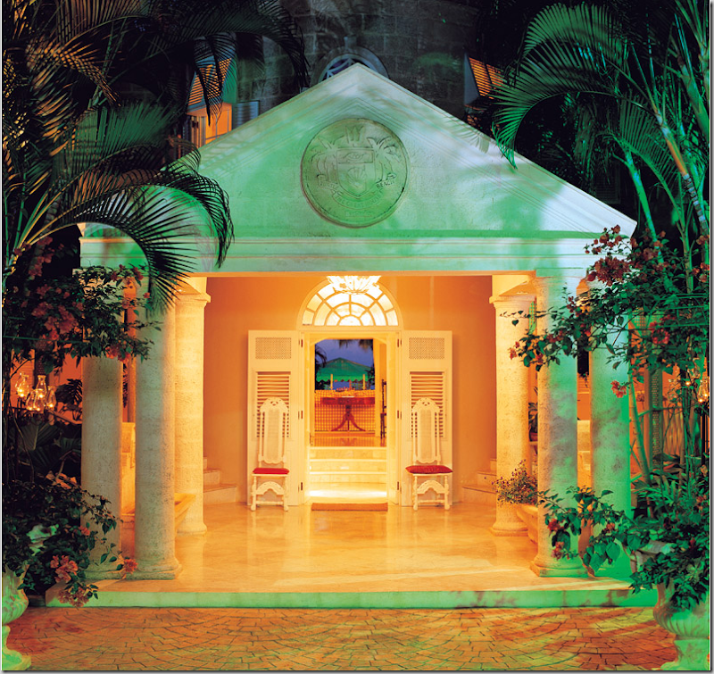
NOW: The front entrance to The Great House with its classical columns and pediment. The round tower behind is the stairwell. The building is made of local coral stone – most older buildings were made of this material, but today, it comes at a great expense. The stone ages quickly and is a perfect surface to give a new home a patina. Through this front door, the eye goes up towards the main living room, out to the terrace and down in a straight line to the gazebo and deck on the beach. This classic axis is repeated in the gardens of Ascott House in England, the country house of Sir Evelyn de Rothschild.

THEN: The entrance at night. Here you can see the checked fabric on the sofas. Be sure to notice those chairs at the front door!!!!

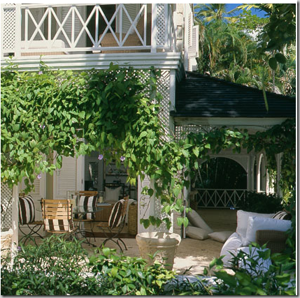
The main building with the three bedrooms on the second floor overlooking the pool. The walkway connects the main building to the four Chattel Cottages on the right of the pool. The open air verandah and bar area is shown on the right of the photograph.

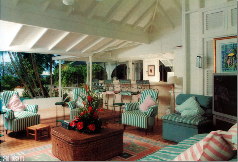
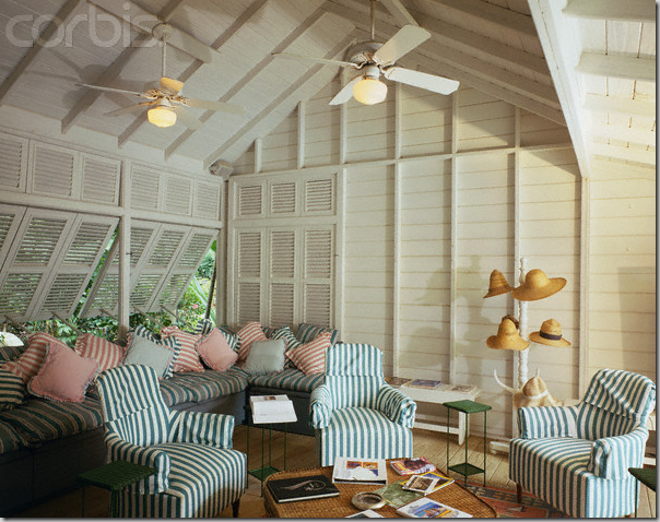
NOW: The open air sitting room and bar area overlooks the pool Beautifully furnished in classic island rattan with seagrass matting, the crisp black and white striped pillows pop against the white slips. What a wonderful space! I love the old black and white photographs framed in cream mats and the hat stand, with all it’s straw hats ready for the beach. The verandah is beautiful - the raised wood ceiling with rafters and beams, the wood ceiling fans, the shutters instead of windows – what a great place to meet before dinner for drinks and appetizers.

Another view of the outside sitting room, or verandah.

THEN: Two views of the same space before redecorating. The rattan coffee table remains but is used as a side table now. All these formal chairs have been replaced with rattan furniture. The dhurri rug was replaced with seagrass, but the barstools remain. Amazing – the huge TV in the corner! This fabric was one design used on the verandah. Below is another, probably earlier version.

THEN: An older view when the rug had not yet faded – yet the flower arrangement looks more faded here. I wonder if this is how the Rothschilds had it? There’s no doubt I like the way this room is furnished today better, but this is not a bad second from the early 90’s.’

THEN: Another view showing the banquette and striped chairs in green with pink accents. The hat stand remains!

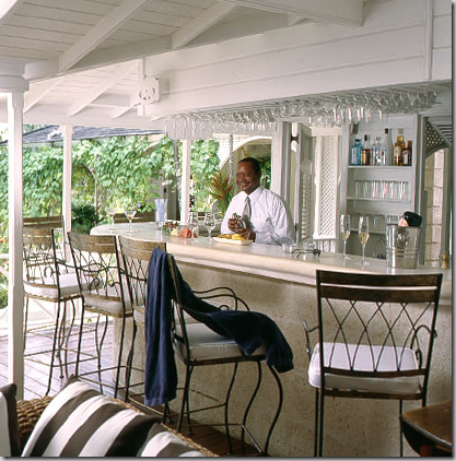
NOW: A close up of the bar. The house is available for rent and comes with 16 employees!

NOW: This view shows the dining area off the piano room – decorated in French styled bistro chairs with the black and white striped pillows. The bar area and verandah is to the right, off this porch.

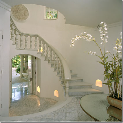
NOW: The entry stair hall with marble floors and stone treads. The marble is a surprise here – but I suppose with the Rothschild’s – nothing is too grand, even for a beach house. Today the stairway is clean and bare, but before – it was different:

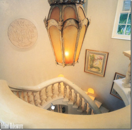
THEN: A dated lantern with yellow frosted glass and prints lining the stairs; I think it looks better today – bare! I do love the inlayed medallion which matches the one placed in the pediment outside.

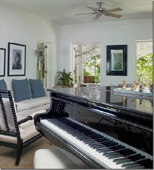
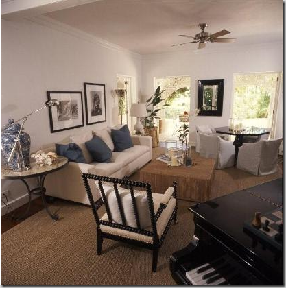
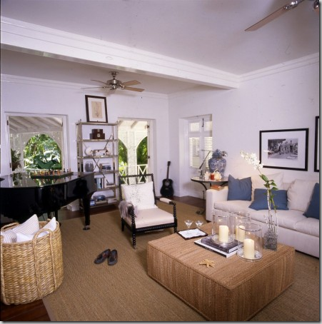
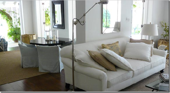
NOW: Inside the main house, the piano room, redecorated in white and light blue, with black accents and seagrass. I adore the bobbin chair and the black and white photographs. These windows face the pool area and the view towards the beach.

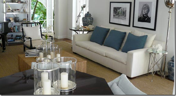
Another view of the piano room showing the round table with slipped armchairs. Blue and white with black accents is perfect for a sophisticated beach decor.

Another view of the piano room. Whoever did the styling for these photos was really awful I think. Instead of looking casual, a lot of the rooms look plain messy. The stylist loves to use shoes in his/her pictures too. Hey – straighten those pillows! This view looks outside the back side, as opposed to the beach view.

Ah – this picture is better styled. A nice touch to create a summery, beach feel in any house is to use large candles in glass hurricanes – the more the better. The seagrass is another good summery element, as are the white slips and navy accents, along with blue and white ticking as seen on the table chairs. Blue and white porcelains add to the beachy ambiance, and wicker and baskets are essential to create the summer atmosphere.

THEN: The piano room during the 90s. Much more formal and less beachy. Check out those arm covers on the wood frame chairs! Wow!!!! It looks like a napkin! RULE: Don’t use arm covers. If you HAVE to, have the upholsterer make tightly fitted ones that are almost impossible to detect. Notice how dated the throw pillows are – flat and small. I prefer larger, down filled pillows – I usually order them in a 22” size with a 24” inset – it makes the pillow really luxurious. And this reminds me of why I loathe trim – check out the trim on the chair cushions, why???? Why did we ever do this????? RULE: Do NOT use contrasting trim or welt on upholstery – it looks like marks-a-lot. Trim on upholstery should be subtle and beautiful – this is neither. Leave the trim for the throw pillows OR the skirt. Differences – THEN: the walls are painted a yellow color and there are curtains. NOW – the walls are white and the windows are bare – giving a very beachy, clean feel to the house. Myself, I would have used beautiful flowing white linen curtains here, but that’s me. I always like curtains in any room!

A poor photo – but another picture of the earlier piano room – looking towards the back side, not the beach. Check out the trim on the cushions to understand what I mean when I say marks-a-lot! The fabric is beautiful, but the trim takes away from it!

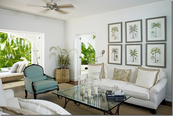
NOW: The main living area. When you walk through the front door, pass the stairs, you reach this room. The view out the window leads to a porch with a long walkway down to the beachside gazebo. The sightline runs from the front porch down to the beach. It must be heavenly! Again – I love these interiors for a sophisticated beach house – white linens and aqua touches with a wonderful set of palm tree prints. White and khaki pillows and what looks like an old chintz fabric lumbar thrown in. Seagrass and rattan and white linen – it doesn’t get any better in my book! Out the window on the porch is a rattan daybed.

Another view of the main living area, showing the stair/entry hall through the double doors. In the corner is an Oly Studio styled armoire.

Yikes: The view of the main living area showing the opposite sofa. OK - this is terrible! The sofa doesn’t fit on the wall!! RULE: never, ever, ever place furniture on a wall that is too short!!!!!! Floating a love seat or chair would have been so much better here – or even just a small console. Through the doorway is the piano room.

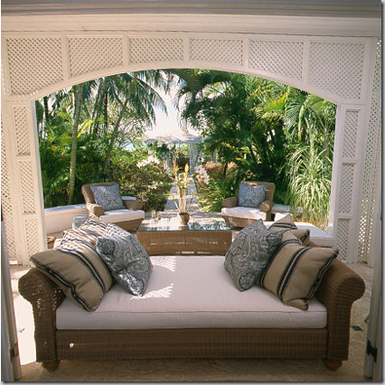
The daybed on the porch with wonderful striped and paisley pillows ala Barclay Butera. The designer brought the living room out onto the open terrace with a large rattan coffee table and two comfy chairs. At the end of the sidewalk is the gazebo that leads to the beach deck – creating a straight axis that runs from the front door to the beach – only thoughtful architecture and landscape design creates this.

THEN: The main living area with checks and painted wood furniture. This is so different from today, but I really like it. The arrangement is totally different with two floating sofas and it IS better with the two chairs on the short wall, left. There is probably a huge TV in that armoire! Also, there are white linen curtains here which today’s designer removed. I love the wood curtain rods with the pineapple finials. What I don’t love is the floral border around the seagrass. RULE: never, ever use a floral border or a dark border around a seagrass rug! The border becomes the focal point and will date the rug in a few years. The border says this rug is from the early 90s – without it, it would still be current. Notice the gazebo at the end of the walkway – all lit up for drinks at sunset – so romantic!
 ‘
‘
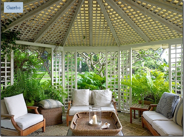
NOW: At the end of the axis from the front door to the beach is this gazebo, perfect for sunset watching. Furnished with blue and white pillows and teak furniture. Lovely.

THEN: Dated outdoor furniture in the gazebo. The NOW picture seems so much more attractive!

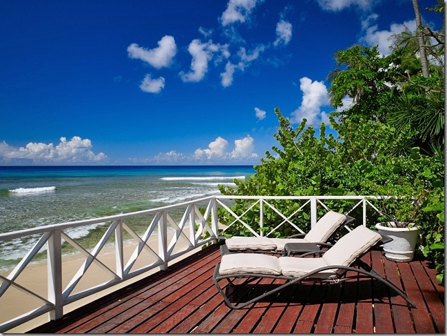
Past the gazebo, on the beach is a deck – at night they set up tables for eating beachside. Those palm trees are incredible!!! The photographer really captured the moment with the sailboat off in the distance framed by the palm trees. Since the house is on the western side of the island – the Caribbean side, which is much less windy than the eastern Atlantic side, the sunsets are phenomenal!

And looking back towards the beachside deck, the gazebo and onto the house.

Beautiful!

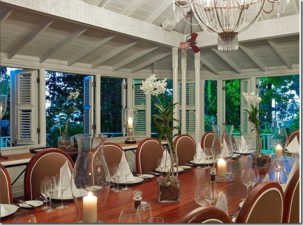
NOW: The dining area is separated from the main house, off by itself in a shuttered building with a vaulted wood beamed ceiling. The kitchen is attached to this building. Not sure about these chairs – they could have found some more attractive ones, imo. The chandelier is also not what I would have used in a sophisticated beach decor.

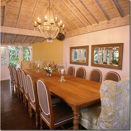
NOW: Another view showing the slipped host chairs. Not too sure about those mirrors either. Or the table. The table and chairs appear cheap – certainly not something you would see in a $27 million house! I would have used an antique Swedish table, painted, with antique painted or slipped chairs. There should be one fabulous mirror flanked by sconces – instead of these two, plain, horizontal ones. Or, there could be a huge, wonderful antique buffet-a-deaux – with open doors, showcasing a large shell collection. RULE: horizontal mirrors drag a room down, vertical ones raise the room up, making it appear taller. This room could be magnificent – not dressy – but with good antiques, it could be beautiful. Instead – it is boring.

THEN: The dining room back in the early 90s – much better! The lighter cream colored chairs are more casual – the whole look is more casual. Not sure what that light fixture is – but it’s better than the crystal chandelier used today.

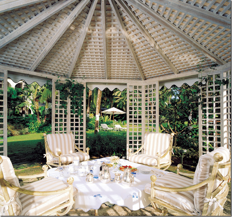
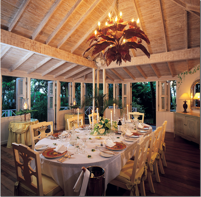
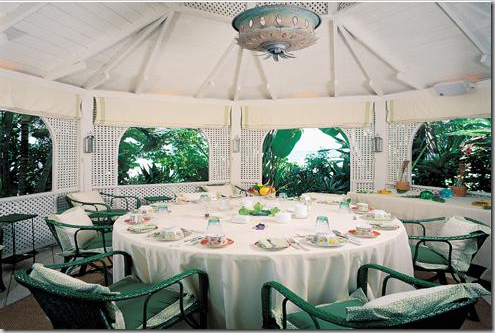
NOW: Past the dining room, on the beachfront is another gazebo – the dining gazebo. Here the chandelier is capiz shells – well suited for the beach. The chairs are rattan.

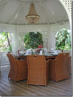
THEN: The dining pavilion in green with an odd hanging fixture. Very dated with very uncomfortable looking chairs. The shades and lanterns have since been removed to streamline the look. Today – the dining gazebo is much better.
The Bedrooms:

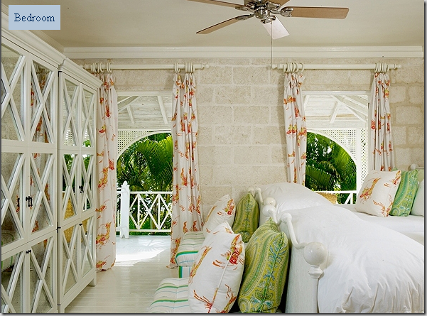
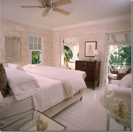
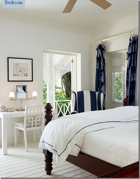
NOW: Bedroom #1. There is one master suite on the first floor in the main building and three bedrooms on the second floor. This bedroom is located on the second floor – bright and cheery – with Oly Studio styled armoires. The walls are coral stone and the floors are painted wood planks.

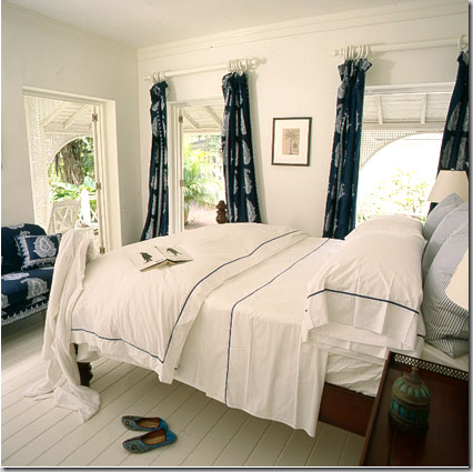
Another view of the bedroom.

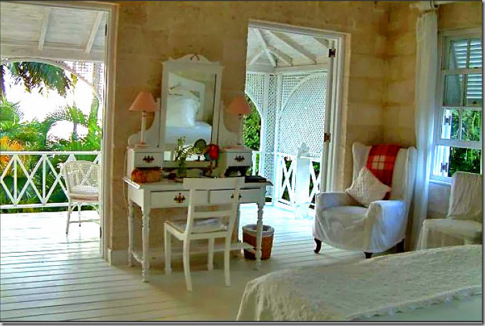
Bedroom #2 – whites and mirrored furniture with a shell mirror taken from the “before” decor. The mirrored tables appear to be from Oly.

THEN: This bedroom used white furniture and appeared cheaply decorated for a Rothschild.

THEN: another view of bedroom #2 before. The architecture in the three upstairs bedrooms is wonderful with the coral stone walls, trellis shutters, and French doors leading to the private balcony that is attached to each upstairs guest room.

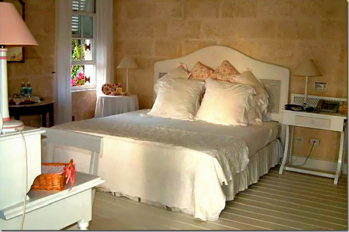
NOW: Bedroom #3 – nice linens and curtains. But the star is that dresser – I think it’s beautiful!!!!

THEN: Bedroom #3, the daybed is now in a Chattel Cottage and the shell mirror goes to bedroom #2.

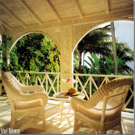
THEN: Each upstairs bedroom has its own balcony – decorated with white wicker chairs. I like these, but I prefer the darker rattan used today on the balconies – more streamlined.

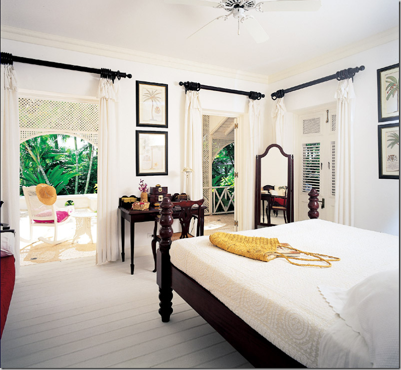
This is the downstairs master suite with a beautiful mahogany four poster bed and West Elm vanity table and chair. Love that vanity mirror with sconces!

Styled differently with the shoes! and a sofa.

THEN: The master bedroom with the same bed, styled more English-Anglo and much simpler with heavy wood furniture. These palm prints ended up in the main living area downstairs. Today, the curtain rods are painted white for a more summery feel.

THEN: The terrace off the master bedroom leads to the main living area – to the left. Today, the interior designer uses rattan chairs with white upholstery on the balconies and terraces off the bedrooms.

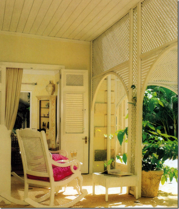
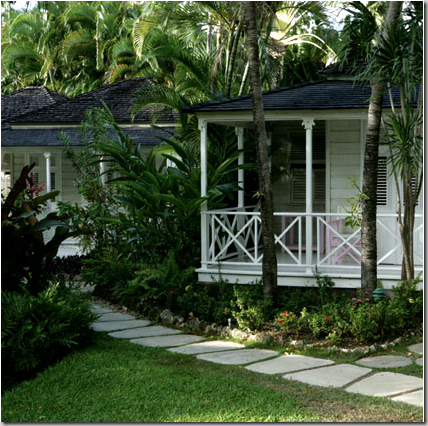
The four Chattel Cottages – newly built to resemble century old employee and slave housing seen on old sugar plantations in the Caribbean. Each cottage contains a bedroom, two pink and two blue themed rooms.

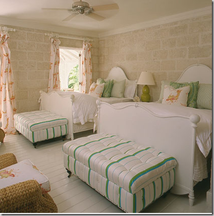
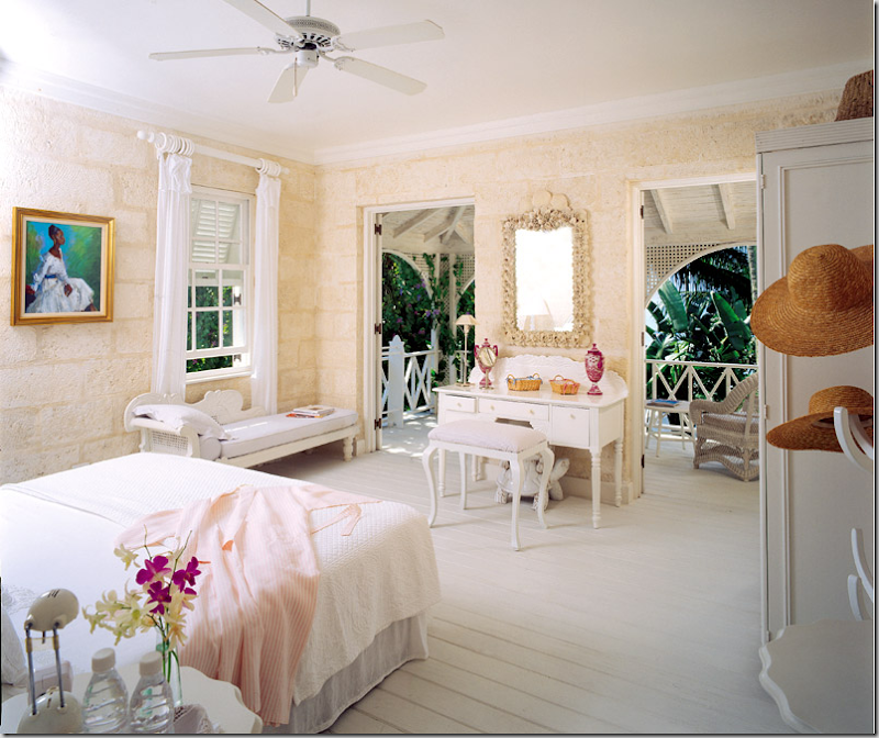
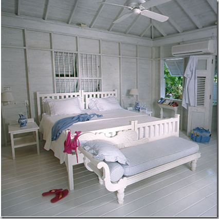
The Chattel Cottage bedrooms – with the shoes and bathing suit styling! This daybed was taken from an upstairs bedroom.

A charming photograph of the shuttered windows and door at a Chattel Cottage.

Oh my!!!! Who is this? This is the London Bachelor from last year with Shayne Lamas who eventually got the final rose! The final three girls flew down to Barbados and they all stayed at The Great House. Though the location was unannounced, the reality TV bloggers studied each frame and then looked at every villa available for rent to determine where they were staying. It was quite a detective job. Here they are eating in the gazebo, well, kissing – the chairs are the same from the gazebo. On the show, this bachelorette asked London boy if there were palm trees in England! Yes – she did. The blond winner is the young daughter of actor Lorenzo Lamas.

The Rose Ceremony on a terrace at The Great House. The trees were colored greener on the show than they are in real life – apparently the island wasn’t lush enough for the producers.

On the reality TV blogs – they took shots off the TV to compare with stills from The Great House’s web site – to prove that’s where The London Bachelor was being filmed. And yes – you can see the shot above matches the pictures from the pool area of The Great House! Must be some bored bloggers out there! (moi included!)

Remember the rule – no trim on cushions! Perfectly modeled here by Shayne Lamas' mother, Michelle Lamas from the London Bachelor. Oy!

So, where does Sir Evelyn de Rothschild live now since he pulled out of Barbados? Well, a lot of places. Here, the handsome banker is shown with his third wife, the infamous Lady Lynn Forester de Rothschild, a multimillionaire in her own right through her telecommunications businesses. They married after his divorce from Victoria – whom he shared The Great House with. They are pictured here in their London townhouse- the art studio of the famous artist John Singer Sargent.

Lady Lynn de Rothschild made headlines last year when she suddenly became a republican. She was quoted as saying she changed parties because she thought Obama was an “elitist.” Surely, she can’t be serious! Who’s the elite one here? Married to one of the world’s richest man, with a mansion in England, a townhouse in London and an apartment in New York. I tried to find where their vacation home is now, but no luck – anyone know?

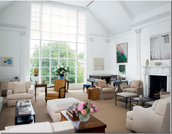
NOW: The elegant London townhouse of the Rothschilds. Famous for being the former studio of the artist John Singer Sargent. Contemporary furnishings and art mix with priceless antiques. David Mlinaric is the designer. Mlinaric also helped Sir Evelyn’s cousin, Lord Jacob de Rothschild with his famous Waddeston Manor. Sir Evelyn says that this house was the only one in London he ever wanted. When it came on the market, he snapped it up.

THEN: Sargent’s studio – looks like the bottom window was closed off for light purposes. What a glorious window! See a fascinating account of blogging sleuthing about this studio and the Rothschild connection by Things That Inspire and Brilliant Asylum.

Another view of the main studio. Amazing how they have used seagrass here! This makes me never want to hear another client say seagrass isn’t “good” enough for them! If it’s good enough for a Rothschild……

THEN: A side view of the studio – showing the classical pilasters on each side of the door. When the Rothschilds bought the studio, many of these features had been r

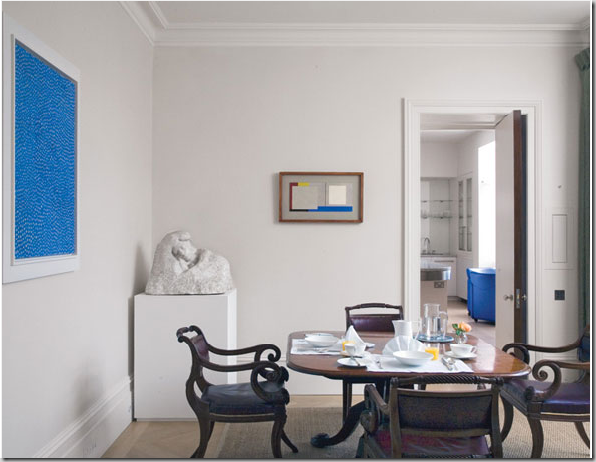
The breakfast room – this room, the kitchen and the office are in a newly built part of the studio. The sculpture is by Rodin. Notice how the blue goes from the large to the small painting in to the kitchen. I wonder if these chairs are part of the set of 14 chairs in the dining room. They look like they might be. All this art work and gorgeous furniture and all I can see is their seagrass is cut too short!!!!! Seagrass should be custom cut 3 to 10 inches from the wall.

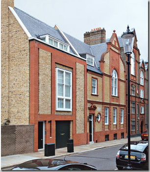
NOW: The studio is seen on the right – the new building built by the Rothschilds with the kitchen and office is to the left.

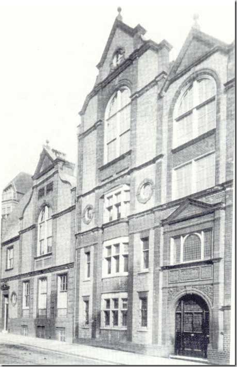
THEN: The studio is the building on the left. Over 100 years later, the building looks remarkably the same.

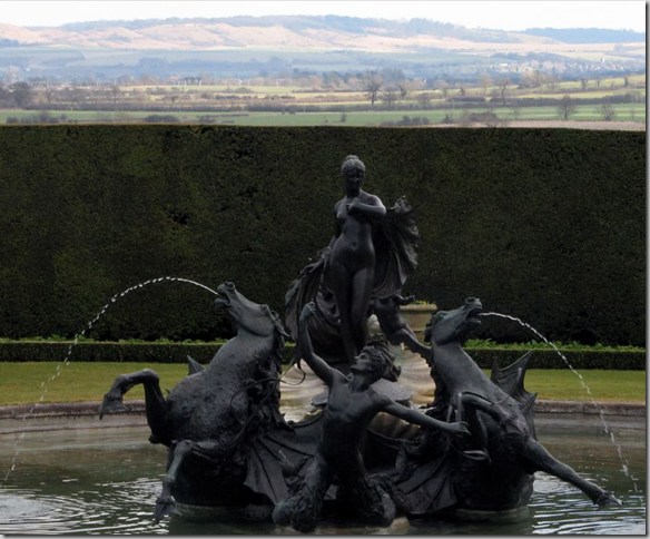
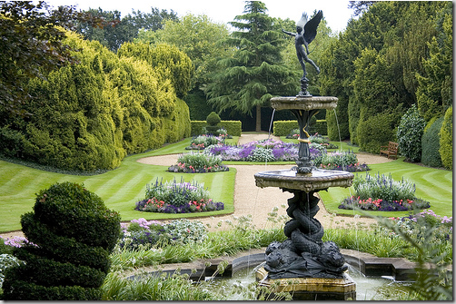
Ascott House, not the Ascot where the women were funny hats, but the country house where Sir Evelyn de Rothschild lives with his lovely wife, Lynn. Yes, you know – that non-elitist Lynn! Part of the house was donated to the National Trust and is open for tours. The gardens are absolutely gorgeous. Here, a fountain of Venus overlooks Ascott House.
-
The other side of the fountain, looking over the Chiltern Hills. The estate is so large that a highway was recently built going right through the property. Sir Evelyn planted a forest of trees to hide it. The road separates the house from the stud farm. Aw…..

The garden is one of the prettiest I’ve ever seen. This is the secret garden. The topiaries on the estate are amazing. And there is a one garden where the hedges are trimmed to spell out a saying. Incredible. As at The Great House in Barbados, most walkways are set up on an axis that draws your eye to the end of the path. All these images are from flickr.com. If you want to see more of the garden, go here.

Just to give you an idea of the size of the estate!

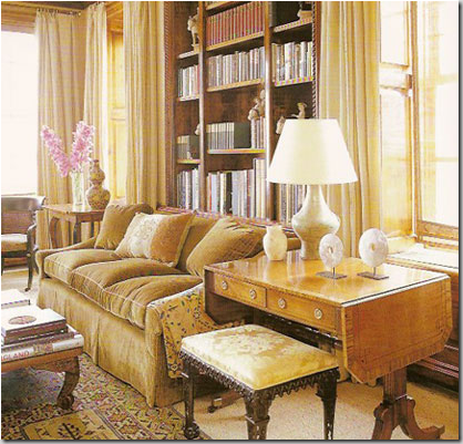
And here, Sir Evelyn and Lady Lynn have an apartment in New York City, designed by none other than Michael Smith, the Obama’s new White House designer. Interesting to imagine what that man knows! This apartment was published in Elle Decor, Oct. 2003 and is featured in his books. Here is a glimpse of the living area – so typical of Smith, antiques and a warm, cozy ambiance. This room looks so livable, anyone would feel comfortable here, not just a Sir or Lady.

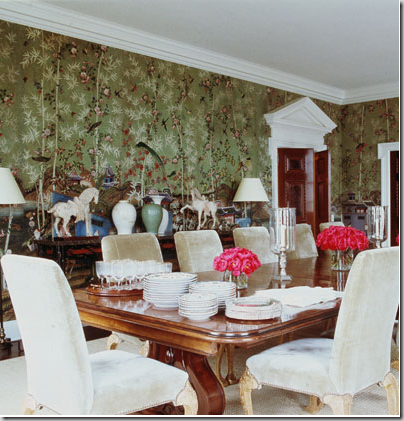
The dining room – so Michael Smith. He repeatedly uses de Gournay wallpaper in dining rooms to great effect. Notice the beautiful pediment over the paneled wood doors – beautiful!

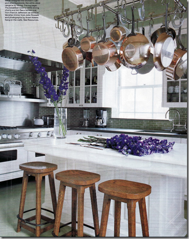
And finally! The kitchen in NYC. This looks like a kitchen that is used! That collection of copper pots is making me see green, This kitchen resembles an English country house space where the owners never venture out to where the staff works!
I hope you’ve enjoyed a glimpse into the life and houses of the Rothschild’s. Thanks to Style Court for the NYC pictures and Things That Inspire and Brilliant Asylum for the great detective work on the Sargent Studio in Chelsea.
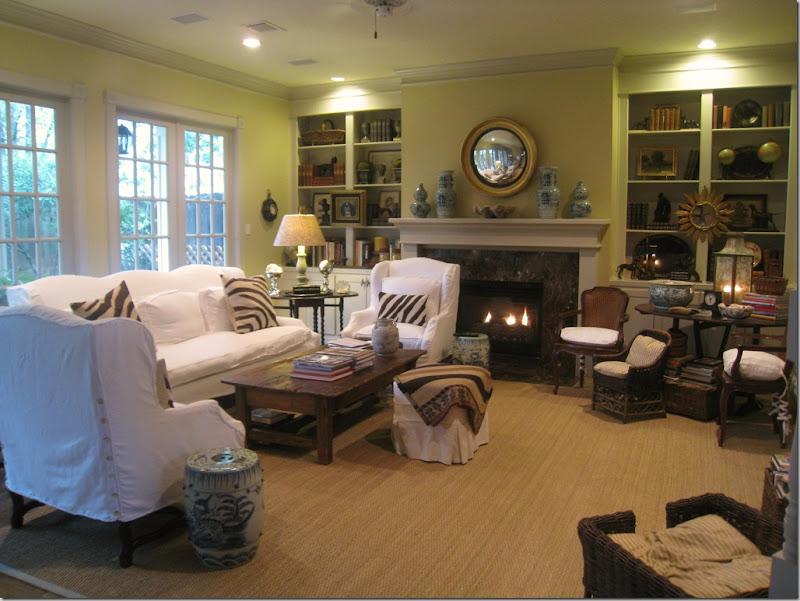
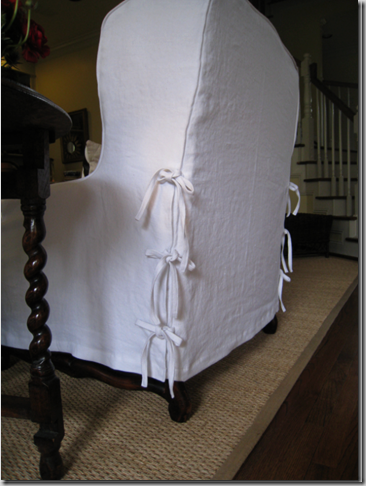
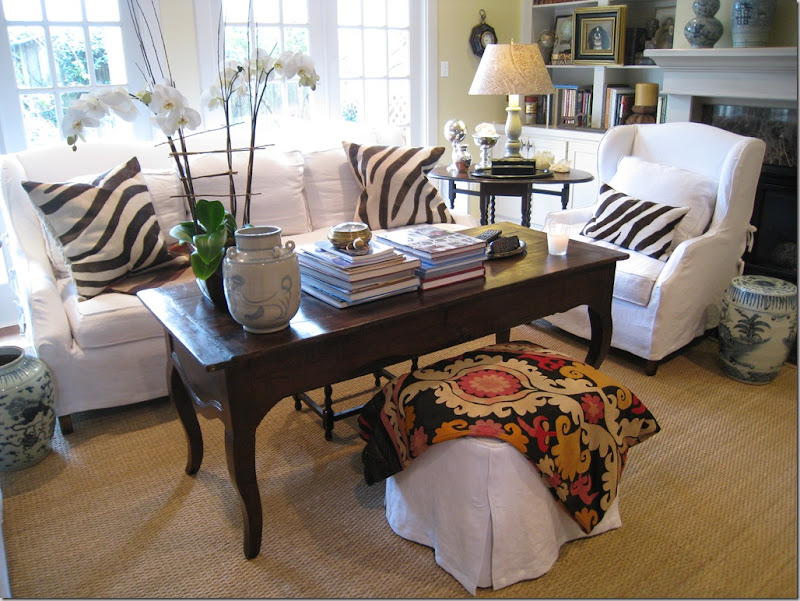
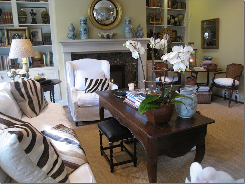
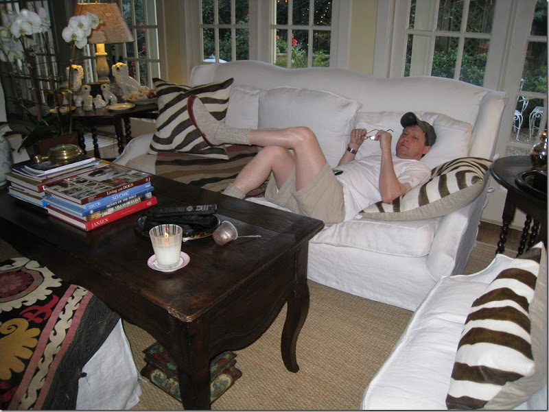
You know when you buy something and it’s just not “right” from the beginning. Well………when I bought my sofa and chairs a few years ago, the day they were delivered, I took one look at the slipcovers and had to stop myself from crying. I could see immediately that my new, fresh, white linen slipcovers had NOT been washed prior to being made! Needless to say, I was devastated. And shocked. And beyond angry. You see, the person who made them knew better. I mean, how many slipcovers had she made before mine? Hundreds? Thousands? And what really added fuel to the fire was that waiting in my garage were 40 yards of freshly washed white linen that I had bought just for the job. I didn’t use that fabric because the slipcover person had already gone and ordered the fabric herself, so I kept my washed linen for a future client. Thinking over my options - I didn’t know whether I should send all the furniture back the next day, or try to wash the slips myself and see how much they shrank. After much discussion, getting nowhere fast, I just decided to forget it for a while and deal with it, like Scarlett, on another day. When the time came to wash the slips for the first time (because with white linen – that time DOES come!) I used cold water, and dried them in a barely warm dryer and put them back on damp, while trying to stretch the fabric. Of course they shrank, but they did still fit – barely: the cushions were so tight that the bottom one wouldn’t lay flat. I always knew it would have to all be redone down the road so eventually I called Shabby Slips to come to my rescue.









![[mnaeve+046.JPG]](https://blogger.googleusercontent.com/img/b/R29vZ2xl/AVvXsEg8bTEFkv97U6TVLbNbCWNIbNasEs_M15SwtCK6lyiz0OXaGfNn6BJq3C2h_6mSvkzvlMyjSdYfODxmlxe93fItYb4g0p_Ys67Fk4_G0VGQszk1YJku1vaF3J2h17-Gp6BokVXIQ70kiay-/s1600/mnaeve+046.JPG)
![[mnaeve+044.JPG]](https://blogger.googleusercontent.com/img/b/R29vZ2xl/AVvXsEhCZ4aGjUHp-Mh3fIrUDxIauIp0oP4ksrpNFAnMYM7glENB8swE4odt8wTtjdg9rPS1eZtbhyphenhyphentBkN3XFqNtQpphjqWj_1LGKrTC142w8Yd5xKUwzdveSIZARPQXTqlZPtr7FZ10IG6s7X9W/s1600/mnaeve+044.JPG)
![[mnaeve+029.JPG]](https://blogger.googleusercontent.com/img/b/R29vZ2xl/AVvXsEj8jhJvOlzgfDESgdpc7Gz7giVKTsM84zURu9M3fW_djVNIp-aNQ5YxJNbOuHZ2XiXho6kPKBD7IpRR4OE83d3r3K0oXM3-nJHpKGAy-KPy7G4zwnNygxSXdQJO7_hY4Z8RWQdR41c6KRdt/s1600/mnaeve+029.JPG)
![[mnaeve+031.JPG]](https://blogger.googleusercontent.com/img/b/R29vZ2xl/AVvXsEjWOpyGPGlJLnRhNXoxviBsFtzXUrkBWhFJ0yvNE1kjCXWg-JT9xRKpgyFC5Q0SHD6GNvLvt_ti95cdHaEkUxuTB3jl6F0sl-6-vMBKiRIqM-pmIkHDNUOMNCgwvauzlULOHSX5PwR5VS33/s1600/mnaeve+031.JPG)

