The cover was the first clue that this Veranda was going to be special. I was crazed by the cover picture and by the promise of “Romantic Decorating Returns.” Yes! Finally! This is the Veranda issue we’ve all been waiting for. Might this bedroom be the prettiest one ever seen? There’s that blue again – blue is everywhere it seems. In fact, this entire issue is filled with all different shades of beautiful blues. I’m loving the bench, the bed, the gilt, and the Hodsoll fabric on the gorgeous curtains.
Dear Dara,
I’ve been harsh, I’ve been a little mean, but Dara, I am asking for your forgiveness. You see, Dara, I haven’t given you a proper chance as the new editor of Veranda. I was still missing Southern Accents and I took it out on Veranda – expecting your magazine to take up the slack and keep serving up gorgeous images month after month. And then, Veranda goes and has a changing of the guards and Lisa Newsom was gone after all these years. And, Dara, I know her shoes were hard to fill. I’ve nitpicked and complained about every issue – loudly - and I’m terribly sorry for that. Because, Dara, this month, you happened to have produced the best magazine issue I’ve seen in a long, long time. Each story is fresh and new and utterly gorgeous. “Romantic Decorating Returns” – I’ll say! My mother warned me. She called a few nights ago asking if I had seen the new Veranda yet. That early warning phone call hasn’t happened in ages. She said, “just wait, you’re going to die over it.” And Dara, she was right. You did good this month. You’ve proved that romance isn’t dead, that decorating is alive, and we can still have pretty. So, Dara, I’m asking your forgiveness. If you never produce another issue this good, it wouldn’t matter to me. This one will be remembered for years and years.
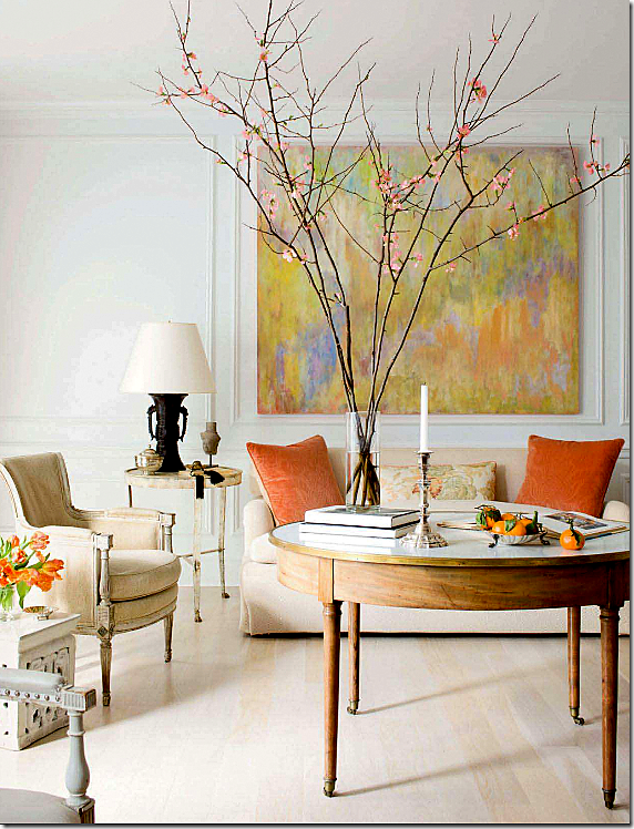
The first story shows a Georgetown townhouse designed by Frank Babb Randolph, done in French antiques, monochromatic fabrics and splashes of persimmon. So refined, so simple, so elegant. Randolph is becoming a favorite of mine. His interiors are always quiet and spare, he rarely disappoints. The owner is an attorney and artist and his canvases are the spark behind the tranquility Randolph created. Max Kim-Bee photography.
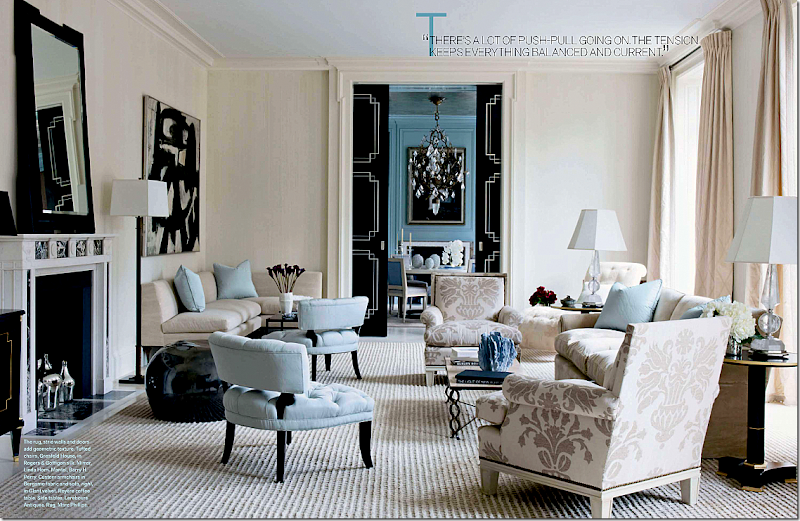
The next story is a stunning NYC apartment by David Kleinberg. Done in blues and creams with black accents, the space is a smart mix of traditional and classic. It has a grown up glamour vibe that reminds one of a Hollywood movie from the 30s and 40s. That’s a Franz Kline over the banquette on the left. Simon Upton is the photographer.
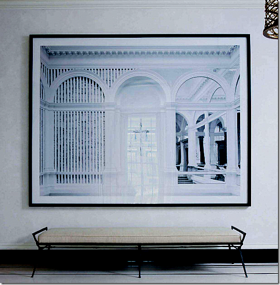
In the same apartment, a large photograph by Candida Hofer is found in the entry hall. See HERE for a story I wrote about her works.
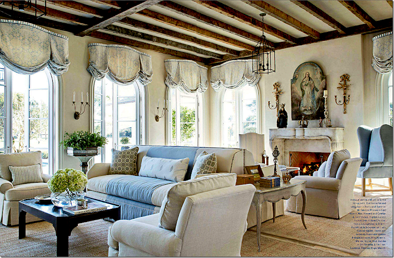
The next house is in Florida, designed by James Howard, partner to the famous Mrs. Howard. Two of the busiest designers around, their work is consistently pretty and consistently perfect. What a gorgeous room! Those windows, that fireplace! I’ve always found back to back sofas to be somewhat awkward but not here! I could stare at this room forever. Again, the house is filled with blues and creams. The cover story bedroom is found in this house, of course. I’m waiting for these two to produce something horrid! They can’t keep up this winning streak forever, can they????? Miguel Flores Vianna photographed the house.
The next story is all about pink and Paris and made me think of House Beautiful’s pink issue. Oh well. I’m sure I’ll be writing a mea culpa to HB soon too. What a darling pied a terre, owned and designed by Roberto Bergero. All bubblegum and black stripes with limes and lilacs thrown in. Photographed by the incomparable Rene Stoeltie and written by his wife, Barbara, it comes from their newest book, Parisian Interiors.
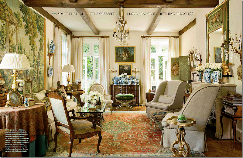
And then there is this house – a French mas found in Atlanta. Designed by Peggy Stone who lives here, and photographed by Peter Vitale. All I can say is I want to move here! The house looks like it is located in the south of France. In fact, at first glance I thought it was a restored mas in Provence. But no, it’s American and it’s new and it’s beautiful. Again, lots of blues – this time of the more aquamarine tones. And skirted tables are back! I counted several skirted dining room tables in this issue, including this house. Belgian who?????
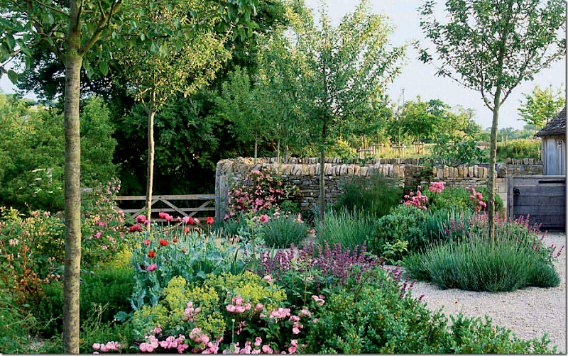
Even if you aren’t a gardener, you will still love the romantic Cotswold garden designed by Jinny Blom. Charming.
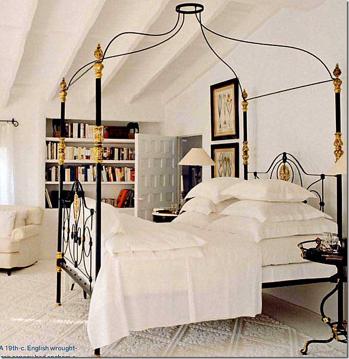
And finally, even the filler articles are great this month. A catalogue on canopy beds includes this antique beauty by Mimmi O’Connell, featured HERE. There’s an article on charm bracelets and turquoise. And back to House Beautiful’s pink issue, there’s a story about five iconic living rooms – all done in pink!
So, Dara, do you forgive me? I’m back in love with Veranda and can’t wait for the next issue!
Thursday, March 24, 2011
Dear Dara:
Monday, March 21, 2011
Readers Picks: Two Houses
Email, we get email! Oy! I love to get emails from readers with leads on stories and pictures of houses they either live in, know, or saw somewhere. Recently two readers sent in pictures of cute houses they saw in real estate online listings. One is from Dallas, which is pretty fair game for this blog. But the other house is in Tennessee! A first here! It’s located in Franklin, Tennessee to be exact and I have NO idea where that is! But, the house is really cute as you will see. So, here are two from readers, and one from me and one from the WTH department. Enjoy!!!
HOUSE #1:
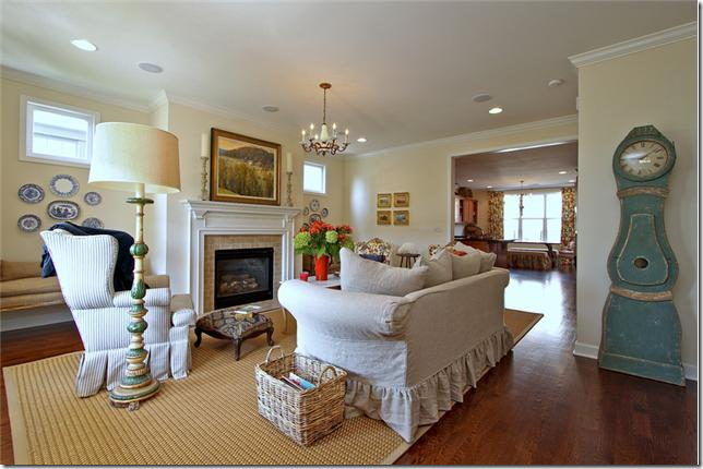
The house in Franklin, Tennessee has a really cute exterior with a picket fence. It looks like this might be some kind of planned community. The house was recently reduced to $389,000. and is 2,030 sq. ft. Built in 2006, it was renovated in 2008 with new hardwoods. It’s 3 bedrooms and 2 1/2 bathrooms. One thing that is great about new planned communities is that a lot of them have rear loading garages (garages on back alleys.) This keeps the street free of unsightly garage doors. I have no idea why America gave up on alleys because our streets are so much more charming without all the driveways, garages, and cars everywhere. At least the planned communities are bringing alleys back into favor.
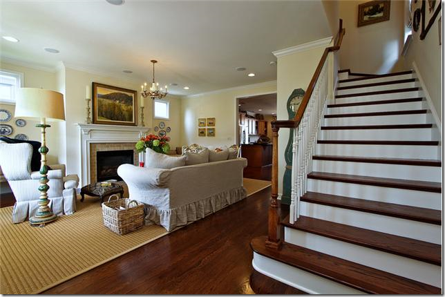
The stairs are right up front, living room to the left. Hardwoods on stairs really make a difference over carpeting. It just always looks so crisp and nice.
Cute Mora clock! What room doesn’t look great with a Mora clock in it? Slipcovered sofa, textured area rug, and window seats flank the fireplace. This room looks monochromatic, right? Well…….
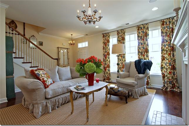
Here, you can the room is NOT monochromatic at all! Don’t the curtains make a huge difference? I’ve gotten to where I really like pattern fabrics mostly on curtains and pillows. These curtains change a room that seemed to be monochromatic into something very bright and cheery.
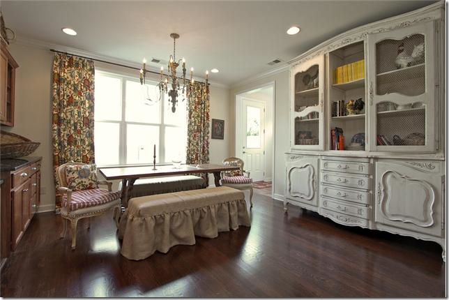
It looks like they used the same fabric in the breakfast room, but I can’t be 100% for sure. This is so cute with the linen slipcovered benches and French chairs for the host and hostess. I keep seeing slipped benches instead of chairs and I really do like this look. Not sure how practical or comfortable this is though! Great antique piece on the right.
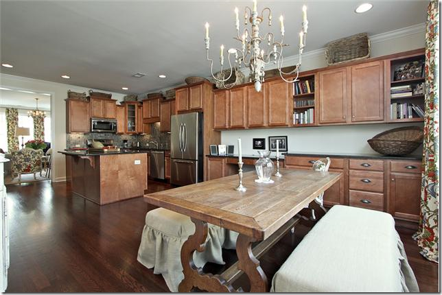
Looking the other way, pretty light fixture and dining room table. This must be the dining room too. I would probably paint the cabinets if I lived here.
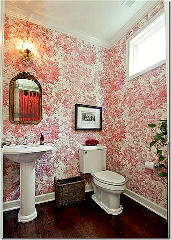
The powder room is wallpapered in a cheery red and white pattern which picks up the reds found in the curtain fabric in the living room. If you like wallpaper but are scared of using it, the powder room is a small enough space to try it out.
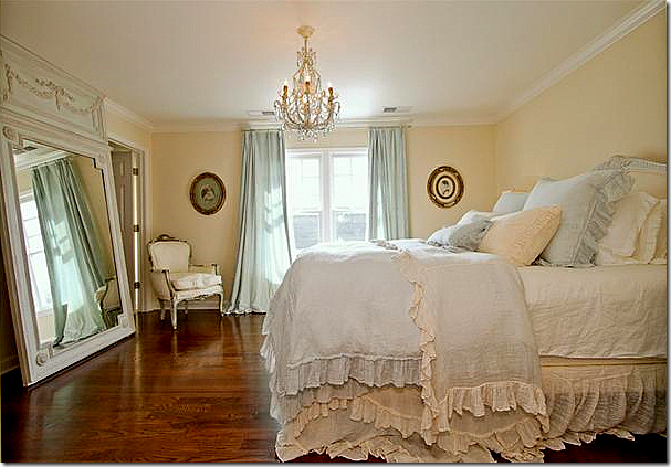
The master bedroom with touches of blue. I keep seeing rooms with just touches of blue and I really love that color combination (although the walls are too creamy – should be painted a little more white than yellow with the blue.) The hardwoods were a great investment. They look so pretty.
The master bathroom replaced the big plate glass mirrors with two small round shell mirrors – which makes such a huge difference. Also, it looks like they fauxed the cabinets – again, a big difference. The blue walls in the bathroom pick up the blue curtain fabric in the bedroom.
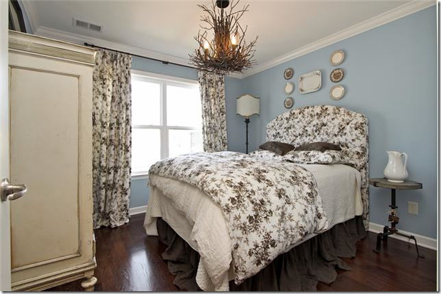
Cute, cute fabrics in the guest room – all grays and blacks and white. And blue! The new accent color. Really cute. Love the long dust ruffle.
The link to the listing for this house is HERE.
HOUSE #2:
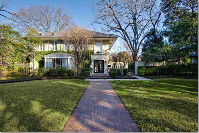
The second house that a reader found is located in Dallas, Texas and is at the opposite end of the spectrum. It goes for $3,995,000.00 and is 5 bedrooms and 5 1/2 baths! It was built in 1917 which really surprised me – houses that old are very rare in Texas.
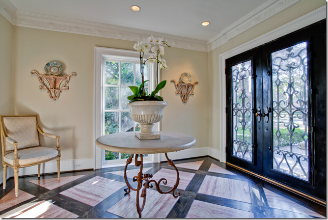
Mixed wood floor and a center table in the entry hall.
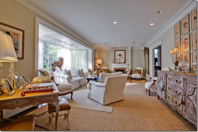
Of course I like the living room with the white furniture and seagrass rug. The big bumped out front window is so interesting. And I love the botanical set over the enfilade.
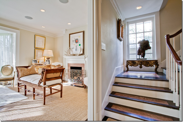
In the living room, there is an antique French bench in front of the fireplace. Notice the mixed wood stain on the stairway treads. Unusual.
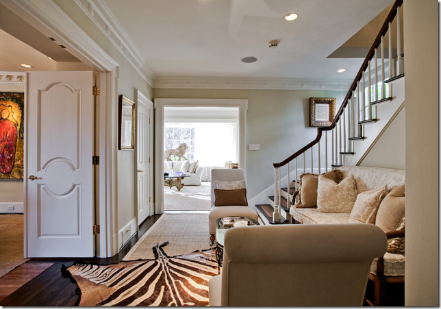
This small area next to the staircase is so cute! Love the sofa and the zebra rug. I still love zebra rugs – I don’t think I’ll ever tire of them even if they are so trendy now.
And off that stair landing room is the dining room, with the trendy Italian chandelier that seems to be everywhere today. Again – yes it’s trendy, but I still love this kind of fixture.
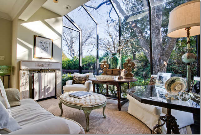
An added study space in a greenhouse type room. Pretty antique accessories and furniture. I love that ottoman.
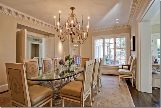
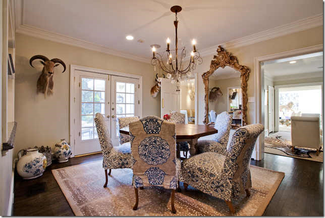
The breakfast room is very dressy and could double as a dining room! Slipcovered chairs in two fabrics and an antelope area rug. Love the oversized mirror and the chandelier. Doesn’t it look pretty next to the stair landing room with the view to the front living room?
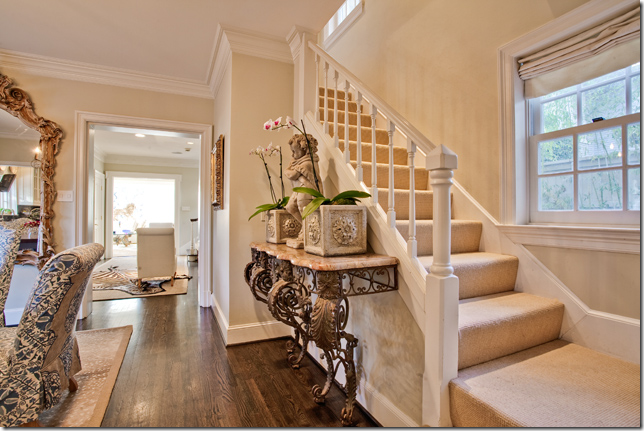
And, a second staircase off the breakfast room. Remember, the house is from 1917 – so there are a lot of changes in the original floorplan I’m sure. I would guess this whole back section is an add on. I like what she put on the buffet – a concrete statue and two planters. Nothing expensive, but it looks like a million.
The kitchen is all new – I love the three plates hanging above the sink.
The family room, off the kitchen.
Blue, again! Pretty linens. Thanks to the reader for sending this house in! The listing is HERE.
HOUSE #3:
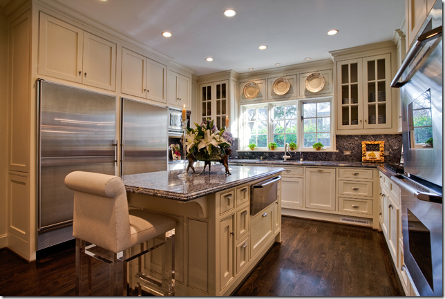
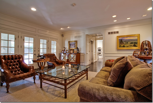
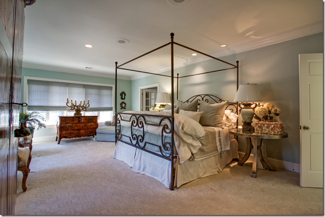
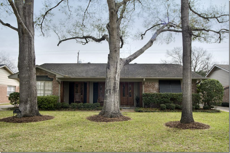
And, my listing from Houston, is a small house in Briargrove, a neighborhood filled with young families just starting out who buy these houses from older empty nesters. Built in 1961, it has 3 bedrooms and 2 baths and is $600,000 – high for the house, but you are paying for the close in location.
This particular house caught my eye because of the updates that have been done – like these beautiful wood French doors that replaced small aluminum windows. They make such a difference. The doors open to a front porch. And to those who think all Houston homes are white slipcovers, here you can see they aren’t! I love those toile covered chairs and ottoman – the furniture is overscaled and really fills up the room nicely – makes it warm and cozy. In new houses, the rooms are always so large and there is never enough furniture in them – making the rooms seem cold and empty. Always try to fill up your rooms with furniture if you want that cozy environment.
The adjoining dining room is painted darker for effect. Restoration Hardware lamps.
The paneled family room was painted light – which is a great way to update dated paneling from the 60s. Notice how much the curtains add to this room. They really brighten up the space and provide warmth and interest.
Looking the other way – I love how they painted the bookcases the persimmon color, which comes from the chair fabric. I do think they should have removed the baby proofing from the coffee table for these pictures! hehe!!!! And notice the wood doors here – this one small change adds so much to the space, creating architectural interest where there really isn’t any. Great idea! Great family room.
More checks. The use of checks in each room is another nice way to visually tie the house together – creating a flow of a design element. The owner has checks and plaids in the living room, the family room and the master bedroom. Cute headboard.
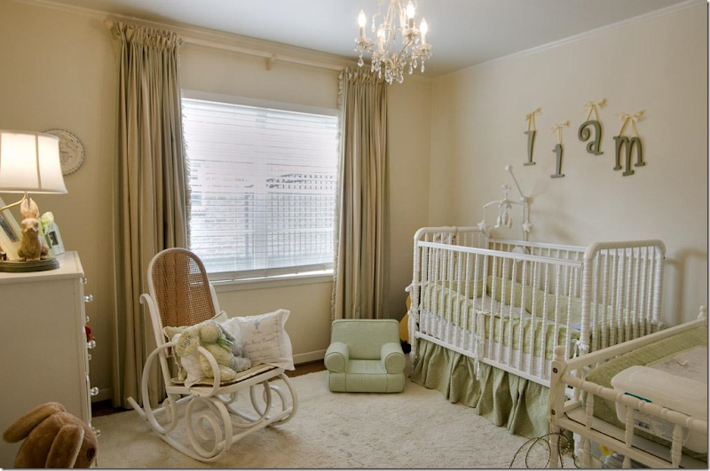
Nursery – more curtains which soften the room. Again, the room might have seemed bare with just the shades and no curtains. Always go for curtains if possible.
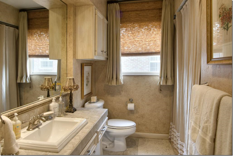
And a redone 1960s bathroom with new countertop and sink. I like the window treatment – good idea for an awkward shaped window. To see the listing go HERE.
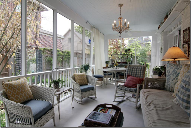
PORCH #1
I found this screened in porch from a HAR listing in West University. I would LOVE to have a porch like this!!
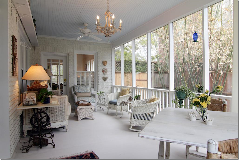
And looking the other way. Houston has so many mosquitos that screen porches are almost a necessity if you want to sit outside.
Kudos to HAR.com for coming online with these new super large images. So great!!!
And finally, in the WTH is this department???????
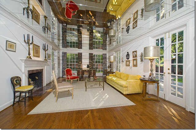
I found this living room in a house for sale in Dallas. It took me a while to figure out exactly what the heck it was. Is this a two story living room with double windows???? No! If you look closely, you can see that the ceiling is mirrored tiles! OMG – this would give me such headaches. I suppose this was done to make the low ceiling appear taller – which it certainly does, but at the same time, it makes it look like there is a chair and sofa hanging upside down in the room. Crazy!!!!
Thank you to the readers for sending in these houses today. If you see a listing you think we would like to see here, please, please send it in!!!!!
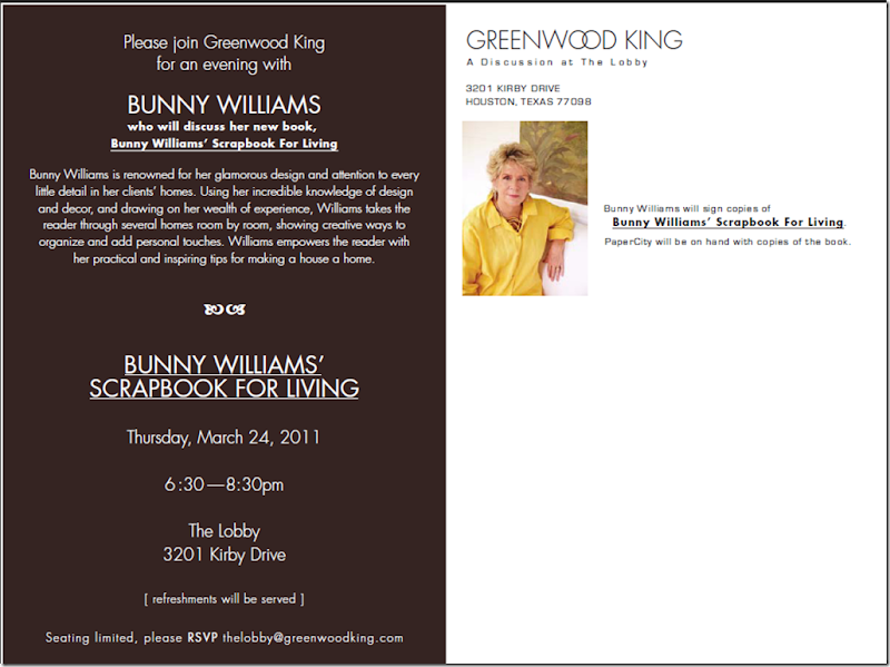
AND FINALLY – HOUSTON WELCOMES BUNNY WILLIAMS THIS THURSDAY!!!!!
SOOOO Exciting!!!!!! Come see Bunny Williams at Greenwood King’s for a Discussion at the Lobby!!!
Thursday, March 17, 2011
A JEWELRY GIVEAWAY: Cote de Texas!
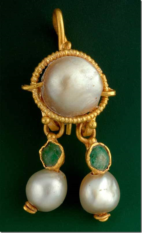
This earring was found in Israel and was originally thought to be from the Byzantine period, around the 4th or 5th century A.D. After the earring was tested in the laboratory, it was discovered to be over 2,000 years old. Amazing. The piece is made out of gold and pearls and emeralds. For something that predates the Christian era, it looks amazingly fresh and trendy, even. I can imagine the jeweler Elizabeth Locke having a pair like these in her collection. If there were two of these, I would wear them to my nephew’s wedding this weekend.
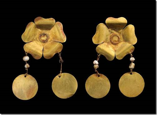
These gold earring are from the 1st century, found in Afghanistan. My daughter recently gave me a pair a earrings that look remarkably similar.
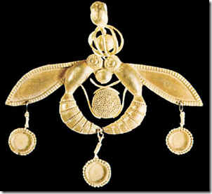
17th century gold pendant – BC, that is! Amazing!!!! The pendant features bees circling the sun. But even at 17 century BC, it’s still not the oldest recorded jewel. That distinction belongs to the beads below:
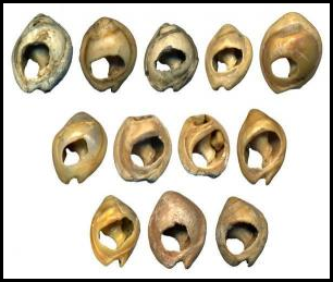
This early string of beads, a total of 41 tiny shells, was found in a South African cave. There are visible holes and wear markings that document these shells were strung together. This necklace is more than 75,000 years old – 30,000 years older than any other ornament ever discovered. Even cavemen were vain, apparently.
A Short History of Jewelry:
Jewelry predates Homo Sapiens. The Cro-Magnon man who roamed the earth from 45,000-10,000 BC made jewelry adorned with engravings that told the story of their great migration from Africa to the Middle east, and on to Europe. Other early examples of jewelry are plentiful. In a Paleolithic cave in the Pyrenees mountain of France, an archaeologist found bracelets and necklaces made out of teeth, shells, mother of pearl and stone – strung with twine or a piece of animal sinew – that date from 17,800 to 6,500 BC. A Spanish cave produced the earliest example of gold jewelry – which also dates to the late Paleolithic period from 40,000 – 10,000 BC. Other metals such as copper, iron, tin, and silver were first seen over 10,000 years ago. Copper in jewelry was first used in 7,000 BC in Turkey. Metalworking was hard business though, until bronze came about in 3,500 BC, which in turn started the Bronze Age. Man really can only speculate what early jewelry was used for, as there is no written language from that age. Cave drawings from 10,000 to 12,000 are too basic to describe jewelry’s importance.
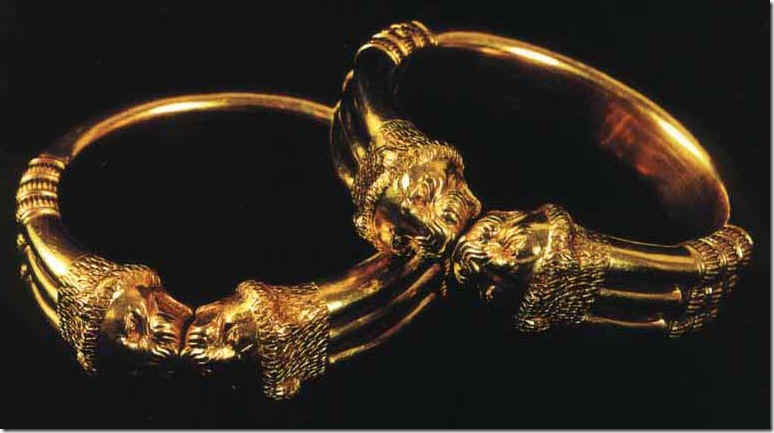
Gold bracelets found at the biblical town of Nimrud.
Many references to jewelry are found in the bible. Solomon's son paid a ransom in temple treasures and jewelry that belonged to the royal women. Jezebel was adorned with jewelry. Gold jewelry from Nimrud was discovered. Along with the Israelites, early Egyptians valued jewelry, especially that made of gold, which came from Africa. The early Greeks and Romans also wore jewelry. Greek jewelry was influenced from Asia after Alexander’s conquests. Roman women in particular wore large amounts of jewelry. The early Roman design, the fibula, which looks like a safety pin, is still produced today. Back then, the decorative fibula was used to pin clothing together. They were adorned with Sri Lankan sapphires and diamonds from India. Cameos and intaglio carvings were also popular with the early Romans, both of which are still popular styles today. Later in time, the Byzantine people used jewelry laden with gemstones. Men limited themselves to signet rings, similar to English men today. India was another country where jewelry was prevalent. Initially Indian jewelry was made of clay and shells, which was later replaced with glass and metals. India used their ornaments to ward off evil and pay dowries and slave beads were used as trading currency.
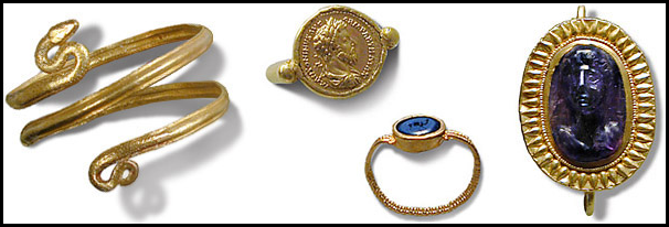
Early Roman jewelry: a snake bracelet and a coin ring that features emperor Marcus Aurelius (121 AD to 180 AD). Roman men were required to wear at least one ring, which was used with hot wax to seal documents and letters. The fibula, an early safety pin, held Roman clothes together. Here an intaglio is seen on the fibula’s front.
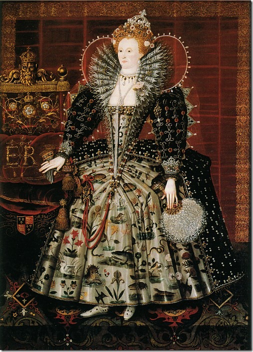
Queen Elizabeth I adored pearls, which were said to signify her virginity.
Coming out of the Dark Ages into the Renaissance, much jewelry of that age has been lost. The Thirty Years war caused great havoc on the civilized nations as all their natural resources were used to further their causes. Examples of jewelry from this time are almost non existent. After the war was over, France led the fashion movement and jewelry was changed completely with new designs. Old settings were melted down and reshaped to fit the trends. Gemstones became more important than the setting and the cutting of stones became an art. The Rose cut was most popular, but by 1640, stones with 16 surfaces started appearing. Amsterdam became the world’s stone cutting headquarters – as this is where the Portuguese Jews were expelled to. The design of the setting became more paramount: diamonds were set in silver and gem stones were set in gold. During this period, Baroque pearls fell out of favor while strings of pearls gained popularity. Enamel used in jewelry came primarily from Switzerland where only a few craftsmen could master the challenging art. One of the largest changes in jewelry came about in the 17th century. Before this time only royalty and upper class wore jewelry. But, in France, Italy and Holland, the country class were now able to afford to wear gold and silver ornamentation and it became part of their peasant costumes. This provincial jewelry rose in importance, while the upper class could only stand by and watch these societal changes.
The 18th century brought about Romanticism which had a huge impact on jewelry making. Modern archaeology revived an interest in ancient jewelry styles. The growing middle class’ desire for jewelry brought about the beginnings of costume jewelry and the development of paste and gem stone substitutes, something that today is still a huge portion of the market. At this time, goldsmiths flourished as the upper class required jewelry that was set apart from the costume varieties. This all changed when in America, Tiffany and Co. opened its doors in 1837 and Pierre Cartier opened their doors in France in 1884. Italy was the home of Bulgari. These jewelry stores signified the beginning of the mass production studios, which forever changed the individual craftsman’s dominance in jewelry making.
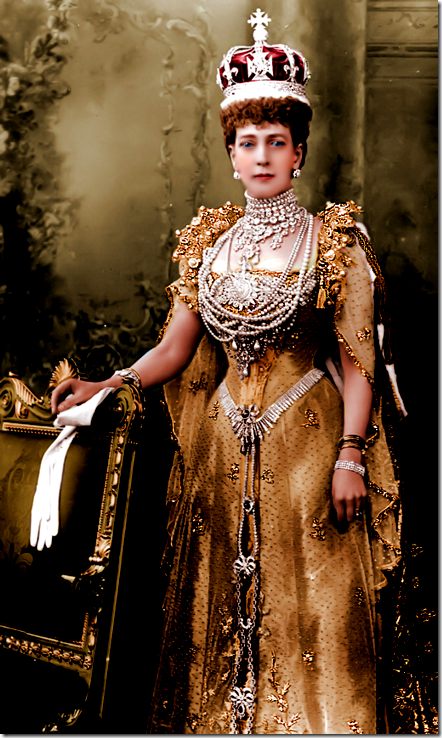
Queen Alexandra, Queen Elizabeth’s great grandmother, loved jewelry and she was only ever seen covered in pearls and diamonds.
The royal jewelry is never sold, it is simply passed down from generation to generation. Here, Queen Alexandra is seen in the pearls and diamonds that she passed down to her daughter in law, the future Queen Mary.
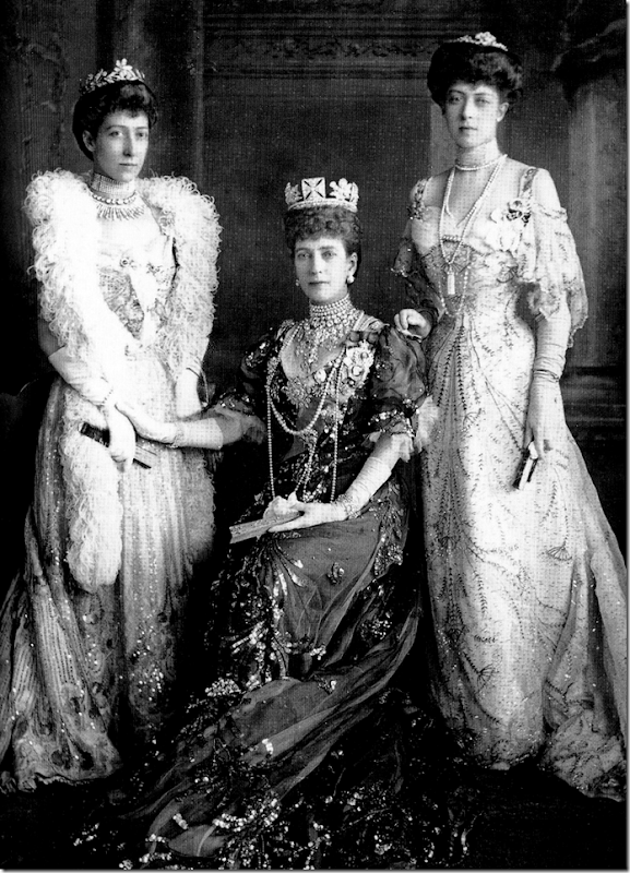
Queen Alexandra wearing a tiara which her great granddaughter, Queen Elizabeth has been wearing throughout her reign.
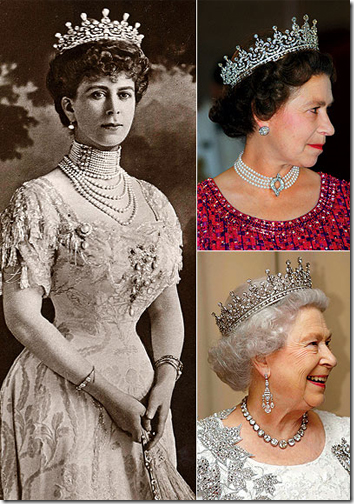
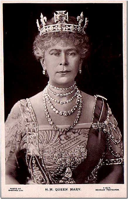
Queen Mary, Queen Elizabeth’s grandmother, wearing strands of diamonds she got from her mother in law.
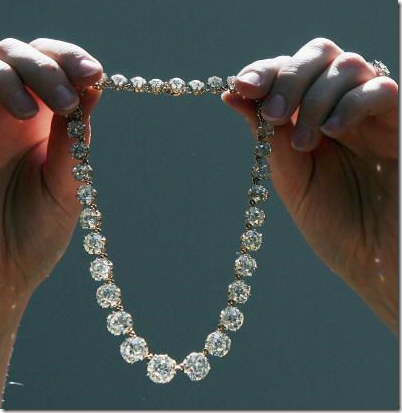
Some of these same diamond strands were passed down to her granddaughter Princess Margaret. After her death, these diamonds were auctioned off, something that is rarely seen within the royal family.
And now, to the giveaway!!!!
The designer, Leslie Andrews, who creates all the jewelry for her company, Tarnished Lace, recently contacted me about a giveaway. Her jewelry appealed to me because she uses vintage pieces to make her unique, one of a kind pieces. Here is how she describes her work:
“I love bits and pieces of jewelry ephemera from previous centuries. I collect antique ivory, Venetian glass, crystal and mother of pearl beads, vintage rosaries, tarnished sterling charms and other tiny mementos to recreate necklaces, bracelets and earrings which evoke a sense of history. Additionally, I design and fashion heirloom pieces from clients' personal collections of family jewelry. This is my passion. Each item is unique and tells a story. The majority of components in each piece is a true antique (over 100 years old) or truly vintage (over 50 years old). My goal is to design beautiful, well-made, affordable jewelry which connects with the past.”
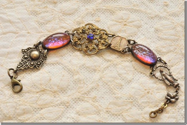
In picking out one piece of jewelry for the giveaway, we decided on the Victorian Eiffel Tower bracelet, as a tie in with the French theme of the blog. This piece is loaded with both vintage and antique treasures: the opalescent glass ovals and silver fleur de lis are circa 1940 and came from a necklace previously owned by a west coast opera singer. The Victorian filigree snowflake is circa 1900 and is encrusted with six clear rhinestones and a royal blue center stone. The link is from a post war souvenir bracelet from Paris and there is also a vintage sterling silver Madonna with a halo of tiny stars and sterling silver rose blossoms. All this on one bracelet! The winner of this giveaway will receive the Victorian Eiffel Tower bracelet, compliments of Tarnished Lace.
How to Enter:
Simply go to the Tarnished Lace web site here: http://tarnishedlace.com/gallery.html
Look at her items for sale and find one piece of jewelry that you really love and which speaks to you. Come back here to the comments section and leave a comment telling me your favorite piece of jewelry. That’s all! The contest will close this Saturday night at 12:00 pm.

