The new October Veranda is out, beautiful– as it always is - full of drool-worthy houses that are totally out of my price range – just like I like it. But on closer inspection, the October Veranda looks familiar, very, very familiar. Why? Might it be because two of its feature stories have already been seen here on Cote de Texas. What? I’m kidding, right? Nope. What’s going on with Veranda today? Why the recycling of old stories?
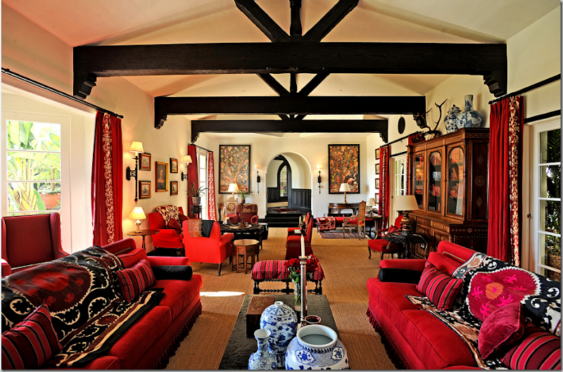
“OY Suzani!!” story from Cote de Texas March, 2009 – seen in this month’s Veranda.
Veranda and the late Southern Accents were always the cream de le cream. They were the two magazines that I would circle the Barnes and Noble parking lot for - waiting on the Thursday delivery truck to bring the newest issues. Over the years, so much has changed, but thankfully, much, like an old friendship, has stayed the same.

Of course Southern Accents is now gone, a victim of the bad economy and scarcity of ads; readership was never the issue. For me, the death knell started when I first noticed the paper they were using. Instead of the usual nice and thick variety, SA switched to thinner and lighter paper. You know, the exact same kind of lifeless paper that Southern Living uses. Cheap. The beginning of the end. When it was announced they were closing their doors, I was sad for days – I say this with no exaggeration. Southern Accents had been such a large part of my life, it was a design bible. Each month I would rush to see if any favorite Houston designers had made it in the issue. This was before the internet and design blogging, and the ability to follow designers portfolios was nearly impossible. Magazines alone made it possible to see what designers were up to; magazines gave you a glimpse into their current aesthetic. It was a family affair. Many issues my mother, or my aunt or my sister would call and we would discuss it, house by house. If it was an rare “bad” issue, we would warn each other: “got the new SA, don’t bother. It’s TERRIBLE this month!” Or, “go get your issue and turn to page 140. I just love that!” You see, these magazines mattered to a lot of us. Back then, they didn’t publish each month and the wait for a new issue was torture. At least SA came more often than Veranda, sometimes it seemed as if the new Veranda would never arrive. But it did and still does, while SA is gone forever.
 All In The Family: This beautiful house was editor Lisa Newsom’s son’s. Another classic cover and story.
Over the years Veranda quietly changed. Their southern-only editorial material went international. The shift was subtle. I hadn’t even realized that change was intentional – I always assumed the non-southern houses were the second homes of rich and famous Dixie-ites. And yes, Veranda’s paper quality suffered too, just like SA’s. Pick up an old Veranda and feel the difference, it was almost like reading a design book, certainly not some rag you could pick up at the grocery store. Which brings up another difference – Veranda was never found in a grocery store or a drug store. It was special, a jewel that didn’t mingle with Track & Road or True Romance. You had to seek it out to find it. But that’s no longer true either since Hearst bought the magazine in 2002. Veranda even went digital a few months ago and finally rolled out a viable web site. Will wonders ever cease?

Ay. Was there ever a prettier cover? Simple perfection in a Belgian country mansion owned by that country’s top fashion designer.
Despite all the changes at Veranda, the magazine basically looked the same. It never changed drastically, it just tweaked things here and there. It may think it’s now an international magazine, but its roots are southern and always will be. A few months ago founder and editor Lisa Newsom quietly stepped down, replaced by former domino alum Dara Caponigro. Gulp. domino and Veranda? The blog gossip was brutal. It wasn’t personal against the new editor who is universally respected, it’s just we didn’t want OUR Veranda to become the “how to get this look for less” magazine for Kappas and Pi Phis. So far, so good. I haven’t noticed Dara’s impact yet, but I’m sure it is coming and will probably be good. She knows what she is doing. Young and talented, maybe she is what the magazine needs – fresh blood and all. I just hope she knows what to do with a Pam Pierce or a Carol Glasser house, the importance of them and others like them. The verdict is out.
Which brings me back to this issue – why all the old features? Much of this month’s Veranda is very old, recycled news for Cote de Texas readers and bloggers in general. On the Skirted Roundtable, then House Beautiful editor Stephen Drucker told us (listen HERE) that he liked to run features as soon as they were photographed. He didn’t believe in holding onto stories longer than a few months, a year - tops. It’s unfair to the designer, he said, because if you run work they completed four or five years ago, it doesn’t really reflect their current style. Five years is an eternity in the design business.
 A Houston legend: Kay O’Toole’s former highrise apartment.
So, what happened this month at Veranda? I KNOW I shouldn’t be writing this. I should keep my mouth shut and be a good little blogger. I don’t like to go negative here, and I rarely do, but, I’ve gotten numerous emails from readers about this, questioning it. Making editors unhappy isn’t in the best interest of bloggers.
On the last Skirted Roundtable (Listen HERE), we discussed the importance of blogging to magazines, again. Yet again! I said and I do strongly feel this, that a few years ago the magazine editors seemed apprehensive of bloggers potential power and they courted us. Today, they are no longer threatened and shouldn’t be. Blogs and magazines work hand in hand. Blogs need magazines, not the other way around and editors know this now. We aren’t a threat, we never were. We’re more like free advertisers, valuable advertisers for sure, but still free.
Digital magazines like Rue and Lonny pose much more of a threat than bloggers like me or “My Pretty House” do. Still, as Margaret Russell told us on the Skirted Roundtable (OK, enough with the Skirted Roundtable already!!) popular bloggers might reach 50,000 readers a month. Magazines reach over 200,000. That statement alone put us in our place, fast. Reflecting on Russell’s views, I’ve taken myself much less serious. I’m not a magazine, I’m not a writer, nor am I a photographer. I’m just a woman sitting in her sweat pants with holes in them pontificating from my backyard about what I like. Trust me, there’s no one quaking in their boots about this.
 October’s House Beautiful: Is it an ad or an editorial statement? Who paid for it and why?
Still, it was a shock when I read a two page ad/editorial in the new House Beautiful defending magazines against the internet by asking “Will the internet kill magazines? Did instant coffee kill coffee?” Two pages with no hint as to who wrote it, who paid for it and why. According to the ad, readership is up, especially in the younger, most important demographic. Magazines, the ad says, do what the internet doesn’t: “neither obsessed with immediacy nor trapped by the daily news cycle, magazines promote deeper connections. They create relationships.” Yep. I agree with that. I live that. But two pages to make a point? Someone sounds awfully defensive. And speaking of immediacy and daily news cycles, how old should a project be before a magazine deems it too old to run? Why hold onto stories when you risk the chance of the pictures leaking out to the internet months and years before you finally go with it?

J. Randall Powers gorgeous townhouse project in this month’s Veranda. This project has long been one of my favorite of Powers. Photo from PaperCity who ran this story years ago. Additionally, pictures of the townhouse showed up on real estate web sites when it was put up for sale.
So, buy the new Veranda, I did. As usual, the photography is gorgeous. Their pictures cover both pages in many instances and there are some wonderful designers featured this month. Although if you are short on cash, you might just want to read this story of mine “Oy Suzani” – from March, 2009 (HERE.) It’s the same spec house from Mary McDonald shown in this month’s Veranda. Pictures of this house have shown up all over the internet this past year. Or, to read about the Randy Powers house also featured this month, see my own article called “Chinoiserie Central at Piano Nobile” HERE. This gorgeous townhouse by Powers was actually first shown years ago in PaperCity, a Houston magazine. I know Powers is thrilled to have his work seen in Veranda, no doubt, but I can’t help wondering if he would have rather had a more current example of his work shown. Probably. Then, there is the profile on Timothy Whealon, that wonderful young interior designer, which showcases a house that has already been featured all over the blogs. The bloggers took their pictures from Whealon’s own web site. I’m sure Veranda would have preferred Whealon not post those pictures until their story was published, but how many years could they expect him to hold off? One, two, three years? Once a photograph turns up on the internet, it goes viral, it spreads from blog to web site to blog, over and over like a nasty cold, until no one can actually say where the original picture came from. And yes, I know, copyright issues and the internet are much debated, heated topics best left for another time.
Finally, there’s the Veranda story about Edith Head – yawn. Please don’t tell me that Veranda is going to take up Architectural Digest’s mantel and showcase Hollywood ad nauseam. Now that Margaret Russell is heading up AD, maybe their Hollywood adulation will end. Hopefully. But really, Edith Head in Veranda? Seriously?
 October’s House Beautiful: gorgeous new decor – eye candy to inspire, to lust for, to dream about. Interiors like this by Daniel Sachs are why House Beautiful is at the top of their game.
I know times are tough for the magazines. And like I said, I probably should just kept my mouth shut and hope that maybe soon we’ll be getting current stories from Veranda never seen before, of projects just completed. I can’t recall ever seeing a house in House Beautiful that was first shown all over the blogs. I could be wrong about that, but that magazine always looks fresh and current. And it is always a a surprise, a visual feast. This month’s cover story shook me to my core, leaving me to question, again, my own aesthetic. The heavily ethnic, Indian and English inspired interiors by Daniel Sachs left me speechless. Bland Belgian-who???? There are so few quality magazines left, so few design magazines of any kind left, and I want to be surprised, I want to be speechless, I want to be inspired. I want to get my magazine and have my mouth fall open and just stare and gape and read and reread and scan in the pictures and talk about them here on the blog or on the Skirted (ok ok ok – I won’t say it again).
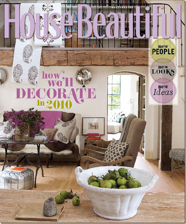
Jill Brinson’s Atlanta house was the subject of much adoring blog buzz.
The last time that truly happened for me was House Beautiful’s cover story of Jill Brinson’s house HERE. GAWD. It inspired me, it awed me, it made me green with envy in a very good way. It provoked discussion and blog buzz. I want that from my magazines. Every time, every issue. Too much to ask for? Probably. Yes. Too much. I’ll settle for once a year.


